Collections, cart and pages
Collection pages and filters
Filters, sorting, the sidebar, Shop the look tiles and the compare tray.
 Storefront · desktop
 Storefront · phone
Filters
Filters come from Shopify's free Search and Discovery app. Open it in Shopify admin, choose Filters and add the ones you want: size, color, price, availability, product type or a metafield such as support level. Endurance shows them automatically.
In the theme editor, open a collection page and select Product grid to choose where filters sit:
- Drawer: a button opens the filters over the page. Good for large photos.
- Sidebar or Sidebar on the right: a column of filters beside the products on desktop. Phones always use the drawer.
Filter groups open at start sets how many groups start open (0 closes them all), and Also open these filters opens groups by name, for example Size, Color. A group with a chosen value always opens.
Turn off Enable filtering to remove the filters and their button. The sort menu stays while Show sort is on.
The same panel sets Products per page, Columns on desktop (3 or 4), Columns on phones (1 for large photos, or 2; tablets keep two), the Pagination style, and which toolbar parts show: the product count, sort and the column switch that lets shoppers pick 3 or 4 columns on computers. List view adds a List button to that switch: one product per row, its photo beside the details and a short description (the card's Description block). Under Appearance, Grid spacing → Custom sets this page's own space between columns and rows, and Color scheme colors the whole product area.

Product grid settings: Filters on desktop, how many filter groups start open, and the toolbar switches

Drawer: the Filters button opens the filters over the page, with color swatches, sizes and the price range

Sidebar: the same filters in a column beside the products
When filters leave nothing, the grid says so, suggests removing a filter (or widening the price range when one is set) and lists the active filters as chips that remove them in one tap.
Shop the look tiles
Add a Shop the look block to the Product grid to place a large photo between products, with numbered pins that open the products worn in it. Choose up to three products for the pins and, if you like, only show the tile in certain collections. At the bottom of the tile sit its heading, the number of pieces and a button that opens all of them in one panel, ready to add together.
Pin positions are percentages of the photo itself, not of the tile, so a pin stays on its piece while the tile changes shape across screen sizes. On phones the tile shows the whole photo with the heading and button below it, so no pin is cut off or covered. A product card opens beside its pin, or above or below it where the side has no room.

A Shop the look tile in the grid: numbered pins on the photo, and the heading, number of pieces and Add the look button at the bottom
Compare
Turn on Enable compare in the Product grid. Shoppers tick up to three products and open them side by side. The compare page uses the search.compare template, so keep that template in your theme.
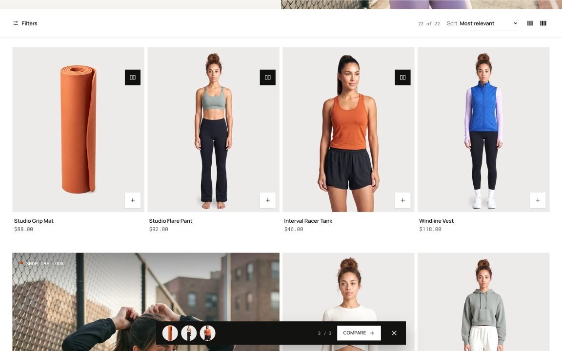
Three products ticked: the compare bar at the bottom shows them and opens the comparison
Collection header
Collection banner shows the title, description and a photo, beside the text or behind it (with text over the photo, the header can turn transparent over it; check the title on a phone and raise Image darkening for a light photo). Its panel also sets the height, left or centered text, which side the photo sits on, a smaller title, the breadcrumbs, and Show the image on phones, which puts the photo above the title on phones; Collection doors adds large links to sub-collections; Collection description puts longer text under the grid, which helps search engines.

Collection banner with Text over the photo: the header turns transparent over it when Transparent over the first section is on
Sort order
A collection opens in the order you set for it in Shopify admin. Shoppers can still sort it themselves when Show sort is on.
- Go to Products → Collections and open the collection.
- In Products, choose an order in Sort: best selling, title, price, newest, or Manually to drag products into your own order.
- Select Save.
The page at /collections/all lists every product in a fixed order. To choose its order, create a collection with the handle all and the condition Price is greater than 0; set its sort as above.
Hide sold-out products
Shopify decides which products a collection holds, so hiding sold-out products is done there:
- Automated collections: add the condition Inventory stock is greater than 0 and set Products must match to all conditions. Products need Track quantity turned on.
- Search results: in the Search and Discovery app, open Settings and choose how out-of-stock products show in search.
On product pages, the variant picker can hide sold-out sizes and colors: see Variant picker → Sold-out options on the product page.
Collection cards
Theme settings → Collection cards sets the cards on the Collections page and in every Collection list whose Image shape is Theme settings.
| Setting | Type | Default | What it does |
|---|---|---|---|
| Image shape | Choice | Square | Options: Square, Portrait, Tall, Landscape, Adapt to image, Circle. |
| Title | Choice | Below the image | Options: Below the image, On the image. |
| Image darkening | Slider 0–80% | 35% | For titles on the image: darkens the bottom of the photo so white text stays readable. |
| Alignment | Choice | Left | Options: Left, Center. |
| Show an arrow after the title | Checkbox | Off |
- Image shape: square, portrait, tall, landscape, a circle for small category icons, or Adapt to image to keep each photo's own shape.
- Title: below the photo, or on the photo with Image darkening behind it so white text stays readable.
- Alignment and Show an arrow after the title: centered titles suit circles; the arrow slides on hover.
A Collection list with its own Image shape (square, portrait, landscape or circle) keeps that shape and takes the rest from these settings.
Send us a screenshot and your store link. We reply within two business days.