Theme settings
Layout, dialogs and cookie banner
Page width, margins, spacing between sections, corner radius, dialogs, the browser tab message, back to top and the cookie banner.
Open Theme settings → Layout.

Theme settings → Layout
| Setting | Type | Default | What it does |
|---|---|---|---|
| Page width | Choice | Full width | Options: Narrow, Standard, Wide, Full width, Custom. |
| Custom width | Slider 1000–2400px | 1600px | |
| Page margin | Slider 16–64px | 32px | Largest side margin. It narrows on smaller screens, down to 16px on phones. |
| Space between sections | Slider 48–160px | 80px | Sections can still remove their top space one by one. |
| Space between sections on phones | Slider 0–120px | 0px | 0 uses five sevenths of the space above, for example 57px for 80px. |
| Section heading alignment | Choice | Left | For the headings above product rows, collection lists, blog posts and similar sections. Headings set beside their text keep their two sides. Options: Left, Center. |
| Section heading alignment on phones | Choice | Same as desktop | Options: Same as desktop, Left, Center. |
| Corner style | Choice | Square | Square suits the default look. Soft uses 10 px for boxes, 6 px for cards and 4 px for buttons and small images; Rounded uses 20, 12 and 8 px. Options: Square, Soft, Rounded, Custom. |
| Boxes | Slider 0–40px | 20px | Large panels, banners and dialogs. |
| Cards and images | Slider 0–32px | 12px | Product and collection cards, photos and blocks inside sections. |
| Small parts | Slider 0–24px | 8px | Thumbnails, size boxes, tags and buttons that follow the corner style. |
| Show back to top button | Checkbox | On | Appears after scrolling down about two screens. |
| Cookie banner position | Choice | Thin bar at the bottom | Styles Shopify's cookie banner in the theme's colors. Shopify style keeps the look and placement set in Customer privacy settings. Options: Thin bar at the bottom, Card in the corner, Shopify style. |
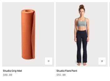
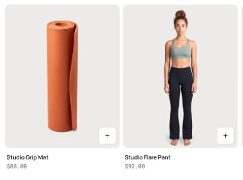
Corner style: square, and rounded
Corner style
Corner style rounds the theme's boxes, cards, photos and small parts together. Square suits the default look, Soft uses 10, 6 and 4 px, and Rounded uses 20, 12 and 8 px (boxes become 16 px on phones). Custom opens three sliders: Boxes for large panels, banners and dialogs, Cards and images for product and collection cards and photos, and Small parts for thumbnails, size boxes, tags and buttons that follow the corner style. Buttons, input fields, badges and dialogs can also take their own radius in their groups.
Space between sections
Space between sections is the gap above each section on computers. On phones the theme uses five sevenths of it, so 80px becomes 57px. Set Space between sections on phones to choose that gap yourself; 0 keeps the automatic one. A section's own Space above and Space below (Small, Medium, Large) scale from these two values.
Section heading alignment
Section heading alignment puts the headings above product rows, product tabs, collection lists, blog posts, videos and recently viewed on the left or in the center, with their buttons, tabs and arrows. Section heading alignment on phones can differ from computers. Sections with a heading of their own design, such as heroes and banners, keep their layout, and so do headings set beside their text.
Dialogs
Open Theme settings → Dialogs to style the windows and side panels that open over the page: quick view, the size guide, product pop-ups, Ask a question, Share, the kit sheet, filters on phones and the cart item editor.
| Setting | Type | Default | What it does |
|---|---|---|---|
| Colors | Choice | The page | Following the section that opens it, a quick view opened from a dark band is dark too. Options: The page, The section that opens it, One color scheme. |
| Color scheme | Color scheme | Scheme 1 | |
| Corners | Choice | Follow Corner style | Options: Follow Corner style, Custom. |
| Corner radius | Slider 0–32px | 12px | Panels that slide in from a side round only their inner corners. |
- Colors → The page keeps the page's colors. The section that opens it matches the band the shopper clicked in, so a quick view opened from a dark product row is dark too. One color scheme gives every dialog the scheme you pick, for example a soft grey that stands apart from the page.
- Corners → Follow Corner style uses the Layout corner style. Custom sets one radius for every dialog; panels that slide in from a side round only their inner corners.
Browser tab
Open Theme settings → Browser tab and write a Message while away, such as Your bag is waiting. While shoppers look at another tab, it replaces the page title in their tab; when they come back, the title returns. Turn on Only while the bag has items to show it only to shoppers with something in the bag. Leave the message empty to turn it off.
Cookie banner
When your store asks shoppers for cookie consent (Settings → Customer privacy in Shopify admin), Shopify shows its consent banner. Endurance styles it to match the store:
- Thin bar at the bottom: a slim bar along the bottom of the screen. Least in the way.
- Card in the corner: a small card in the corner.
- Shopify style: Shopify's own design.
The banner only appears where your privacy settings require it, and it stops appearing once a shopper has chosen.
Send us a screenshot and your store link. We reply within two business days.