Header, footer and pop-ups
Header and announcement bar
Arrange the logo and menu, choose how the header behaves while scrolling, show the country and language selectors, and run the announcement bar.
Open the theme editor and select Header. Menus, mega menus and the links you add next to the icons are on the Menus and mega menu page; this page covers the header itself.

Header selected in the theme editor: the preview outlines it, and its settings open on the right
Layout
| Setting | What it does |
|---|---|
| Desktop layout | Logo left, menu center, Logo left, menu left, Menu left, logo center, Logo center, menu below, Logo left, menu below or Menu in a side drawer (the menu button beside the logo opens the same drawer as on phones, for long menus or a minimal bar) |
| Section width | Edge to edge (the design) or Page width, which lines the logo and icons up with the page column (Theme settings → Layout → Page width) |
| Header height on computers | Compact (56px), Default (64px) or Tall (80px); the menu row of the two menu below layouts stays 48px. Phones keep 64px |
| Logo position on phones | Left or center |
| Logo width on phones | The desktop width is in Theme settings → Logo |
| Open menus on | Hover or Click. Click suits menus with many dropdowns, since nothing opens by accident |
| Search on desktop | The search Icon, or a Search field in the bar: typing in it opens the search panel with the words carried over. It shows on screens 1280px and wider; smaller screens keep the icon |
| Line under the header | A hairline between the header and the page |
| Color scheme | Background, text and icon colors of the header |

The top of the Layout group in the Header panel: desktop layout, phone logo, menus, highlight and the phone menu
The six desktop layouts, from the top: Logo left, menu center, Logo left, menu left, Menu left, logo center, Logo center, menu below, Logo left, menu below and Menu in a side drawer.

Logo left, menu center

Logo left, menu left

Menu left, logo center

Logo center, menu below

Logo left, menu below

Menu in a side drawer
When the menu doesn't fit the bar at some screen width, for example many links or a long translation, the header switches to the menu button and the side drawer at that width instead of letting links run under the logo or off the screen. On wider screens the menu comes back. Shorter link titles, or Logo left, menu below, keep the menu in the bar on more screens.
While scrolling
Sticky header sets what happens as the shopper scrolls:
- On scroll up: the header hides while scrolling down and comes back as soon as the shopper scrolls up. It keeps the page clear on phones.
- Always: the header stays at the top.
- Off: the header scrolls away with the page.
On scroll up: scrolling down slides the header away, scrolling back up brings it back
Transparent over the first section lets the header sit over a full-width photo at the top of a page: the Lane hero, Story hero, a full-screen-height Slideshow, a Video banner without scroll reveal, a Collection banner set to Text over the photo, the 404 page and the contact page banner. It turns solid once the shopper scrolls. On pages that start with anything else, the header is solid.
Text over the photo picks how the header reads over those photos:
- Light text (the default): white text and icons, your light logo from Theme settings → Logo, and a soft shade at the top of the photo. For darker photos.
- Dark text: the header keeps its own text color and your standard logo, with no shade. For light photos, such as a pale studio shot or a bright sky.
On product pages the header can lie over the gallery too: in Product information, set Header over the gallery to Dark text for light studio photos or Light text for dark photos. Dark text keeps your standard logo and leaves out the shade at the top. The product page's own choice wins over Text over the photo.

Header over the gallery set to Dark text: the header lies over the product photos with the standard logo, and the buy box starts below it


Left: Sticky header and Transparent over the first section in the Header panel. Right: Transparent over the first section, with the header on the Lane hero photo and the light logo
Search suggestions
While shoppers type in search, suggestions show matching products, collections, pages and stories. In Theme settings → Search, choose how many products they show (2 to 8) and whether each shows its price and vendor. To change which products match, use Shopify's Search and Discovery app.
Turn off Show suggestions while typing to keep the search panel's blocks on screen while shoppers type; Enter then opens the results page. Search field text replaces the words shown in the empty field. Voice search adds a microphone to the search panel and the search page: shoppers speak and the words fill the field. It shows only in browsers that can listen, such as Chrome, Edge and Safari, and uses the page's language.

Theme settings → Search: how many products the suggestions show, and price and vendor
Country and language
Turn on Show country/region selector and Show language selector to show them in the header. They only appear when there is something to choose:
- Countries and currencies come from Settings → Markets.
- Languages come from Settings → Languages, once a language is published.
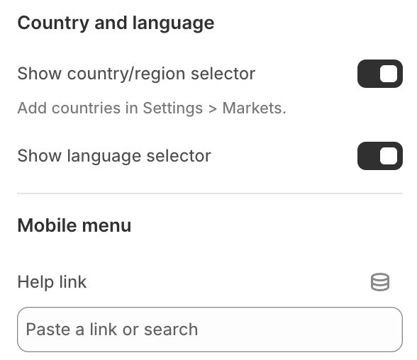
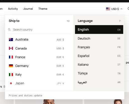
Left: the two switches in the Header panel. Right: the selector with both lists, countries with their currency and the published languages
The footer has its own switch for the same selectors, in Footer → Show country and language selector.
Account
The account icon shows whenever customer accounts are on in Settings → Customer accounts. Customer account menu picks the links shown in the account pop-up for signed-in customers.
Endurance uses Shopify's own account button, which works with customer accounts (the current version, not legacy accounts). Shoppers sign in with a code sent by email, or with Shop, Google or Facebook when you turn those on in Settings → Customer accounts. Signed in, the icon shows their initial or Shop profile photo.
Phone menu extras
Help link adds a link at the bottom of the phone menu, for example to your FAQ or contact page.

The phone menu with a help link: Help sits at the bottom, between Account and the country selector
Phone tab bar
The Phone tab bar keeps the main shortcuts within thumb reach on phones and tablets. Add it in the Popups group at the bottom of the theme editor's section list (it ships there in the theme) and choose up to five tabs: Home, Shop (a collection, or all products), Search, Menu, Account, Bag and your own Link tabs with an icon. Search, Menu and Bag open the same panels as the header, and the Bag tab shows the item count. Leave a tab's name blank to use the default name in each shopper's language, or turn off Show tab names for icons only. A Link tab has no default name: it shows only with both a name and a link.
Style sets its look. Floating dock, the default, floats above the page with rounded corners: each tab shows its icon, and the tab of the current page fills and shows its name. Classic bar runs edge to edge and shows every tab's name. Hide while scrolling down tucks the bar away while shoppers read and brings it back as soon as they scroll up.
On desktop the tab bar is hidden. Bars that sit at the bottom of the screen, such as the product page's add-to-bag bar, move up so the tab bar never covers them, and move down when it hides.

The Phone tab bar as a floating dock on a product page, with the add-to-bag bar sitting above it
Announcement bar
The announcement bar sits above the header. Select it, then use Add block → Message for each message, or Add block → Countdown for a message with a clock.
- Text can contain bold, italic and a link.
- Link makes the whole message clickable, for example to a sale collection or a launch page.
- Show on limits a message to computers (screens 990px and wider) or to phones and tablets.


Left: each message is a block under Announcement bar in the sidebar, here three messages and a Countdown. Right: the bar's own settings, with Style

The announcement bar above the header, with the arrows, the pause button and the close button
| Setting | What it does |
|---|---|
| Style | One message at a time, with arrows, or a Scrolling row with every message in one moving line |
| Rotate messages automatically | One message at a time: moves to the next message on its own; shoppers can also use the arrows and the pause button. Hovering over the bar stops it |
| Change every | With automatic rotation on: seconds per message, 3 to 10 |
| Message width on computers | One message at a time: how wide the message area is, 240 to 1200 px; it narrows on smaller screens to keep room for the arrows. On phones a long message wraps to a second line |
| Speed | Scrolling row: slow, medium or fast. Hovering, keyboard focus or the pause button stop the row; for shoppers who prefer less motion it starts paused |
| Show on pages | Every page, or Home page only. In the theme editor the bar stays on every page so you can edit it |
| Show a close button | A shopper who closes the bar doesn't see it again until the message text changes. Closing it in the editor preview only hides it until the preview reloads |
| Color scheme | Background and text colors of the bar |

Style set to Scrolling row: every message in one line, with the pause (here play) and close buttons at the end
Countdown
A Countdown message counts down to a real date: enter the text before the clock (for example Winter sale ends in), the End date as YYYY-MM-DD and the Time, both in your store's time zone. Over a day away it shows the days, then hours, minutes and seconds.
When the time is up the message shows the Text after the date (for example The sale has ended), or leaves the bar if that text is empty. A countdown with no date and no text after it is left out, so the bar never shows a made-up deadline.


Left: the Countdown block's settings. Right: the message in the bar, Winter drop opens in 21 days and the hours, minutes and seconds
Send us a screenshot and your store link. We reply within two business days.