Sections / Hero and banners
Drop countdown
A launch section with a large photo, a live countdown to a start date, a Notify me email field and the pieces in the drop with their prices. Use it on the home page in the days before a limited product release.
 Storefront · desktop
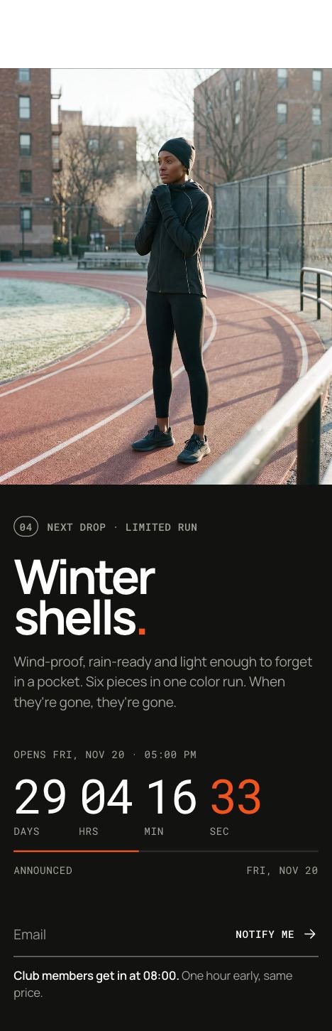 Storefront · phone
Add the section
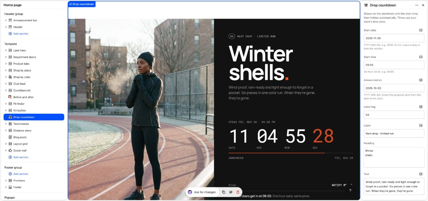
Drop countdown selected in the theme editor: its blocks in the list on the left, its settings on the right.
- In the theme editor, open the page you want it on, for example Home page.
- Select Add section and choose Drop countdown.
- Select Add block to add Floating image.
- Fill in the settings below, then Save.
In the demo store: index.
Image sizes Desktop 2000 × 2500 px, 4:5. All image sizes
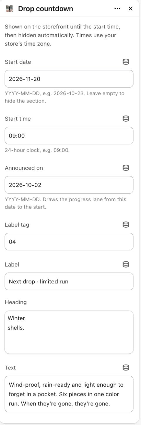
Section settings
| Setting | Type | Default | What it does |
|---|---|---|---|
| Start date | Text | — | YYYY-MM-DD, e.g. 2026-10-23. Leave empty to hide the section. |
| Start time | Text | 09:00 | 24-hour clock, e.g. 09:00. |
| Close date | Text | — | Optional, YYYY-MM-DD. Once the drop opens, the clock counts down to this and the section stays up with its shop button; it hides after. |
| Close time | Text | 23:59 | 24-hour clock, e.g. 09:00. |
| Button once open | Text | Shop the drop | Takes the place of Notify me while the drop is open. Empty link: the collection below, or all products. |
| Link | Link | — | |
| Announced on | Text | — | YYYY-MM-DD. Draws the progress lane from this date to the start. |
| Label tag | Text | 04 | |
| Label | Text | Next drop · limited run | |
| Heading | Text | Winter shells. | |
| Text | Text | Wind-proof, rain-ready and light enoug… | |
| List label | Text | In the drop | |
| Products | Products | — | Pick the pieces in the drop. They show under the clock with their real price; the count and the lowest price are worked out for you. |
| Collection | Collection | — | Used when no products are picked above: its first eight. |
| Pieces in the drop | Text | Storm full-zip, Half-zip shell, Therma… | Used when no products are picked. |
| Button label | Text | Preview the drop | |
| Link | Link | — | |
| Note next to the button | Text | Add a note for subscribers, for exampl… | |
| Image | Image | — | |
| Countdown style | Choice | Start clock | Options: Start clock, Race bib. |
| Race number | Text | 08 | |
| Clock label | Text | Start clock | |
| Show notify me | Checkbox | On | |
| Customer tag | Text | drop-notify | Added to customers who ask to be notified, so you can email them from Shopify. |
| Layout | |||
| Space above | Choice | Default | Options: Default, None, Small, Medium, Large, Custom. |
| Space below | Choice | Default | Default follows Theme settings > Layout > Space between sections and lets edge-to-edge bands touch. Small, Medium and Large are half, equal to and one and a half times that spacing. Options: Default, None, Small, Medium, Large, Custom. |
| Space above | Slider 0–200px | 80px | |
| Space above on phones | Slider 0–200px | 56px | |
| Space below | Slider 0–200px | 80px | |
| Space below on phones | Slider 0–200px | 56px | |
| Divider above | Choice | None | Waves and curves cut into the edge of a section with its own color scheme or a background; a line works on any section. Options: None, Line, Wave, Curve out, Curve in. |
| Divider below | Choice | None | Options: None, Line, Wave, Curve out, Curve in. |
| Show on | Choice | All devices | Desktop means screens 990px and wider. A hidden section stops its timers and videos and does not load its images; in the theme editor it stays visible, faded, so you can edit it. Options: All devices, Desktop only, Mobile and tablet only. |
| Heading | |||
| Heading size | Choice | Default | Options: Default, Small, Medium, Large, Display. |
| Heading tag | Choice | Auto | Changes meaning for search engines and screen readers, not the look. Auto uses H2. Choose H1 only for the main title of a page, such as a home page hero. Options: Auto, H1, H2, H3. |
| Appearance | |||
| Color scheme | Color scheme | Scheme 3 | |
| Image color scheme | Color scheme | Scheme 3 | |
Note Shown on the storefront until the start time, then hidden automatically. Times use your store’s time zone. Shoppers see the opening time in their own time zone, with its name.
Blocks
Floating image
| Setting | Type | Default | What it does |
|---|---|---|---|
| Image | Image | — | |
| Mobile image | Image | — | Shown on phones. Falls back to the image above. |
| Image shape | Choice | Original | Options: Original, Square, Portrait, Landscape, Circle. |
| Width | Slider 60–400px | 180px | |
| Width on phones | Slider 40–240px | 110px | |
| Rotate | Slider -45–45° | 0° | |
| Corners | Choice | Follow Corner style | Options: Follow Corner style, Square, Custom. |
| Corner radius | Slider 0–48px | 12px | |
| Shadow | Checkbox | Off | |
| Loop animation | Choice | Float up | Still when Motion is off or the device asks for less motion. Options: None, Float up, Float down. |
| Position | |||
| From the left | Slider 0–100% | 12% | Where the image’s center sits on the section: 0 is the left or top edge, 100 the right or bottom. |
| From the top | Slider 0–100% | 30% | |
| Layer | Choice | Behind the content | Options: Behind the content, In front of the content. |
| Other position on phones | Checkbox | Off | |
| From the left | Slider 0–100% | 12% | |
| From the top | Slider 0–100% | 30% | |
| Hide on phones | Checkbox | Off | |
Tip Notify me adds the shopper as a customer with your tag (drop-notify by default), so you can email them from Shopify when the drop opens.
Tip Pick products to show them with their real prices, the piece count and the lowest price. Without products, the Pieces in the drop text is shown as chips.
Tip Add a Close date to keep the section up while the drop is open: the clock then counts down to the close and Notify me makes way for the shop button.
Tip Without picked products, the first eight products of the Collection show in the strip.
Tip Floating image blocks place decorative photos over the section.
Tip Countdown style: Race bib pins the clock to a race number over the photo; set the big number in Race number. Start clock keeps the large clock beside the words.
Limitations and troubleshooting
- Hidden on the storefront when the start date is empty or has passed (or, with a Close date, once that has passed). It stays visible in the theme editor so you can edit it.
- Type dates as YYYY-MM-DD and times as 24-hour HH:MM, in your store's time zone.
- The progress lane under the clock only shows when Announced on is set, and only before the drop opens.
Related: Featured product · Video banner
Was this page helpful? No, ask support
Still stuck?
Contact supportSend us a screenshot and your store link. We reply within two business days.