Sections / Products and collections
Kit builder
A step-by-step kit builder. Shoppers move through steps such as Top, Bottom and Layer, add pieces, watch the kit total, and add everything to the cart at once. Use it to sell bundles where shoppers choose their own pieces.
 Storefront · desktop
 Storefront · phone
Add the section
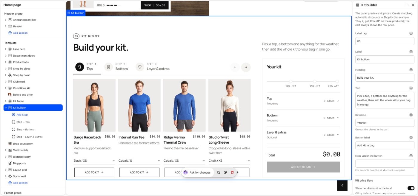
Kit builder selected in the theme editor: its blocks in the list on the left, its settings on the right.
- In the theme editor, open the page you want it on, for example Home page.
- Select Add section and choose Kit builder.
- Select Add block to add Step.
- Fill in the settings below, then Save.
In the demo store: index, page.kit.

Section settings
| Setting | Type | Default | What it does |
|---|---|---|---|
| Label tag | Text | 05 | |
| Label | Text | Kit builder | |
| Heading | Text | Build your kit. | |
| Text | Text | Pick a top, a bottom and anything for … | |
| Kit name | Text | Your kit | Groups the pieces in the cart. |
| Button label | Text | Add kit to bag | |
| Note under the button | Text | — | For example how the kit discount is applied. |
| Kit price tiers | |||
| Show tier discount in the total | Checkbox | Off | Off by default. Turn on only after you create matching automatic discounts in Shopify; otherwise shoppers see a price the checkout won’t give. |
| One of each piece | Checkbox | Off | Shoppers can add each piece once, not several of the same. |
| Pieces needed 1 | Slider 2–10 | 2 | |
| Discount (preview only) 1 | Slider 0–50% | 0% | |
| Discount code | Text | — | Optional. A code made in Shopify (Discounts) for this tier. It goes on the cart when the kit is added; Shopify checks it, and the cart shows only what it really takes off. |
| Pieces needed 2 | Slider 2–10 | 3 | |
| Discount (preview only) 2 | Slider 0–50% | 0% | |
| Discount code | Text | — | Optional. A code made in Shopify (Discounts) for this tier. It goes on the cart when the kit is added; Shopify checks it, and the cart shows only what it really takes off. |
| Pieces needed 3 | Slider 2–10 | 4 | |
| Discount (preview only) 3 | Slider 0–50% | 0% | |
| Discount code | Text | — | Optional. A code made in Shopify (Discounts) for this tier. It goes on the cart when the kit is added; Shopify checks it, and the cart shows only what it really takes off. |
| Layout | |||
| Layout | Choice | Steps and kit panel | Options: Steps and kit panel, Flat lay. |
| Width | Choice | Page width | Options: Page width, Full width. |
| Space above | Choice | Default | Options: Default, None, Small, Medium, Large, Custom. |
| Space below | Choice | Default | Default follows Theme settings > Layout > Space between sections and lets edge-to-edge bands touch. Small, Medium and Large are half, equal to and one and a half times that spacing. Options: Default, None, Small, Medium, Large, Custom. |
| Space above | Slider 0–200px | 80px | |
| Space above on phones | Slider 0–200px | 56px | |
| Space below | Slider 0–200px | 80px | |
| Space below on phones | Slider 0–200px | 56px | |
| Divider above | Choice | None | Waves and curves cut into the edge of a section with its own color scheme or a background; a line works on any section. Options: None, Line, Wave, Curve out, Curve in. |
| Divider below | Choice | None | Options: None, Line, Wave, Curve out, Curve in. |
| Show on | Choice | All devices | Desktop means screens 990px and wider. A hidden section stops its timers and videos and does not load its images; in the theme editor it stays visible, faded, so you can edit it. Options: All devices, Desktop only, Mobile and tablet only. |
| Heading | |||
| Heading size | Choice | Default | Options: Default, Small, Medium, Large, Display. |
| Heading tag | Choice | Auto | Changes meaning for search engines and screen readers, not the look. Auto uses H2. Choose H1 only for the main title of a page, such as a home page hero. Options: Auto, H1, H2, H3. |
| Appearance | |||
| Color scheme | Color scheme | Scheme 1 | |
| Color scheme area | Choice | Full-width band | For a color scheme other than the page’s: across the screen, or in a rounded box within the page width. Options: Full-width band, Box. |
| Border | Checkbox | Off | A thin line round the section, with room inside it. |
| Background | |||
| Background image | Image | — | Behind the whole section. Pick a color scheme whose text reads well on it. |
| Background image on phones | Image | — | |
| Background video | Video | — | Plays silently on a loop instead of the image. Upload it in Content → Files. |
| Overlay | Gradient | — | A color or gradient over the image so text stays readable. Empty: black. |
| Overlay opacity | Slider 0–90% | 40% | |
Note The panel previews kit prices. Create matching automatic discounts in Shopify (for example "Buy 2, get 10% off" on these products); the cart always shows the real price.
Blocks
Up to 5 blocks.
Step
| Setting | Type | Default | What it does |
|---|---|---|---|
| Title | Text | Top | |
| Pieces required | Slider 0–5 | 0 | 0 makes the step optional. The kit can only be added once every step has its minimum. |
| Icon | Choice | Top | Options: Top, Bottom, Layer, Shoe or sock. |
| Products | Products | — | |
| Collection | Collection | — | Used when no products are picked above: its first six products. |
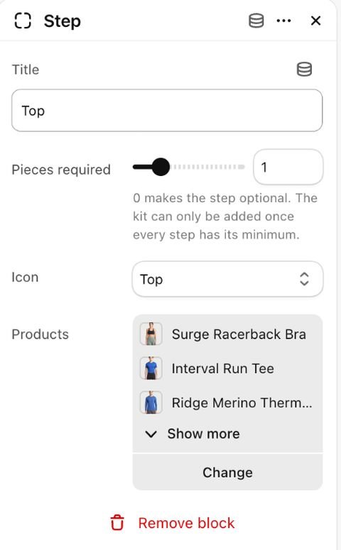
Tip Set Pieces required on a step to make it compulsory. The kit can only be added once every step has its minimum.
Tip The price tiers are a preview only. Create matching automatic discounts (or codes, entered on each tier) in Shopify first, then turn on Show tier discount in the total.
Tip Give a tier a Discount code made in Shopify (Discounts); the code goes on the cart when the kit is added, next to any code already there. The cart shows only what Shopify really takes off.
Tip A step without picked products shows the first six products of its collection.
Tip One of each piece lets shoppers add each piece once.
Tip Layout: Flat lay shows the kit on a table, one spot per step: picked pieces land there as photos, an empty spot opens its step, and a price tag shows the kit total. The steps, pieces and button sit in the column beside it.
Limitations and troubleshooting
- Up to 5 steps with up to 6 products each.
- The theme never makes a discount itself: it only puts on the cart a code you made in Shopify. Without matching automatic discounts or codes, the cart shows the full price.
- Sold-out products are marked sold out and cannot be added.
Related: Shop the look · Style with
Was this page helpful? No, ask support
Still stuck?
Contact supportSend us a screenshot and your store link. We reply within two business days.