Sections
All sections
Endurance has a section for every part of an activewear store. They are grouped below by what they do; open one for its screenshot, settings and tips.
Hero and banners
 Call to actionA rounded band with a label, a heading and up to two buttons, beside each other or stacked, on a color or a background image.
 Collection bannerThe top of a collection page: breadcrumbs, the collection title with its product count, a short intro and the collection image, either beside the text or behind it. It can also link to related collections.
 Department doorsTwo or three tall photo panels side by side, each with a title, a caption and a button, linking to a department such as Women or Men.
 Drop countdownA launch section with a large photo, a live countdown to a start date, a Notify me email field and the pieces in the drop with their prices.
 Headline with photosA large centered headline with small rounded photos set between the words, each with an optional time stamp, and a timeline line underneath.
 Lane heroA full-screen hero with up to four lanes along the bottom, such as Run, Train and Yoga. Shoppers click a lane to swap the photo, and the main button then links to that lane's collection.
 Scrolling textA full-width row of short phrases and small pictures that keeps moving across the page, with a mark between the items.
 SlideshowFull-width slides with progress bars and previous and next arrows. Each slide is a block whose content is blocks too: label, heading, text, buttons, a countdown and a product card.
 Story heroA tall full-width photo with a large heading, a short text and a label. Optional track lines are drawn over the photo when the page loads.
 VideoA video in a rounded frame with an optional heading and text. Upload a video, or paste a YouTube or Vimeo link that plays behind a cover image and a play button.
 Video bannerA full-screen banner with a looping muted video or a photo. Its content is blocks: label, heading, text, buttons, a countdown and a product card, in any order. The banner links to a collection or a page.
Products and collections
 Collection doorsTwo to four rounded photo cards for collections, each with a title, short text, product count and up to two links.
 Collection listA heading, an optional button and a grid of collection cards, each with a photo, the collection name and its product count.
 Featured collectionA heading, a button and a grid of product cards from one collection.
 Featured productOne product with its photos, price, options and Add to bag button. Shoppers can buy it without opening the product page.
 Kit builderA step-by-step kit builder. Shoppers move through steps such as Top, Bottom and Layer, add pieces, watch the kit total, and add everything to the cart at once.
Product recommendationsA grid of product cards chosen by Shopify (related or complementary to the product being viewed), or the store's products in the same color.
 Product tabsA heading with tab buttons. Each tab shows a grid of product cards from a hand-picked list or a collection.
 Quick order listAn order table with one row per product color and one quantity field per size. It shows stock, line totals and a grand total, with one Add to bag button for everything.
Recently viewedA sideways row of the products the shopper looked at recently, with a Clear button and arrows.
 Shop by colorPhoto tiles, one per color, each with a color bar showing the name and piece count. On hover the tile washes in its color.
 Shop by pieceA full-screen list of product types, like Leggings and Shorts. As shoppers scroll, each type's photo fills the screen behind the list and its name lights up.
 Shop the lookA look photo with numbered pins on each piece, next to a list of those products with prices and a total. A button opens a panel to add the whole look to the cart.
 Style withA look photo next to up to four product cards that pair with the current product, with their combined price and a button to add the full kit.
Product page sections
 FAQExpandable questions and answers next to a heading and a help card with up to two buttons. On the product page it lists that product's own questions first.
 Feature stripA full-width row of up to four photo tiles, each with a short title and a line about one product detail.
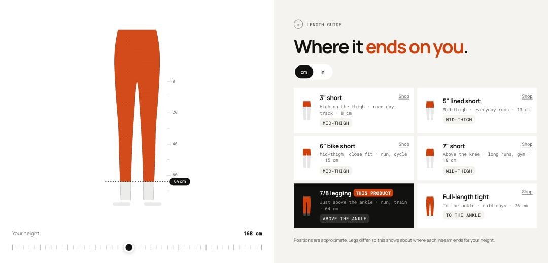 Length guideA leg drawing with a height slider that shows about where each length, such as bike short, 7/8 or full length, ends on the shopper.
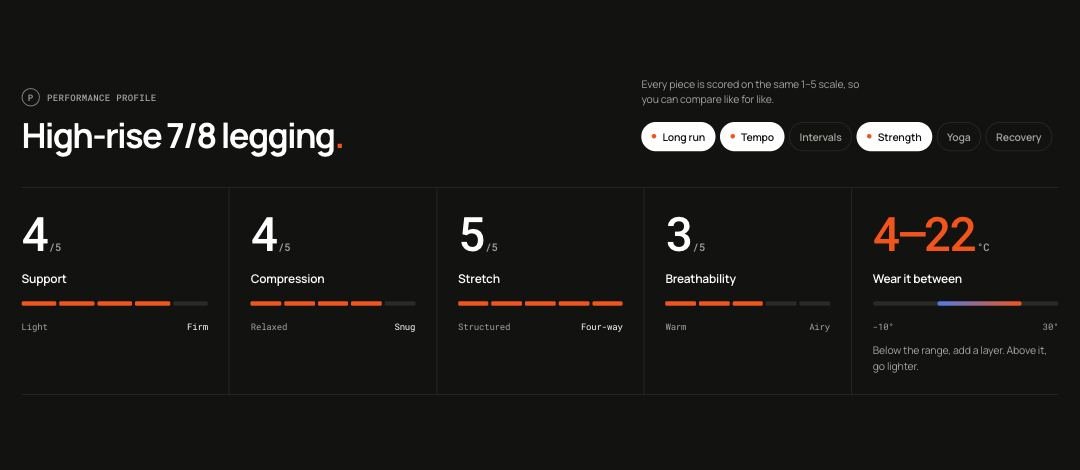 Performance profileA band of 1 to 5 scores for the product, such as support, compression and stretch, plus a temperature range and the activities it is best for.
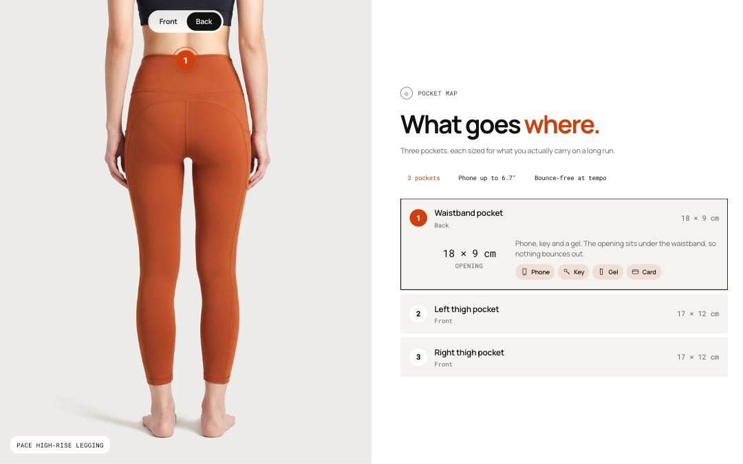 Pocket mapNumbered marks on the product's front and back photos, with a list that explains each pocket, its size and what fits in it.
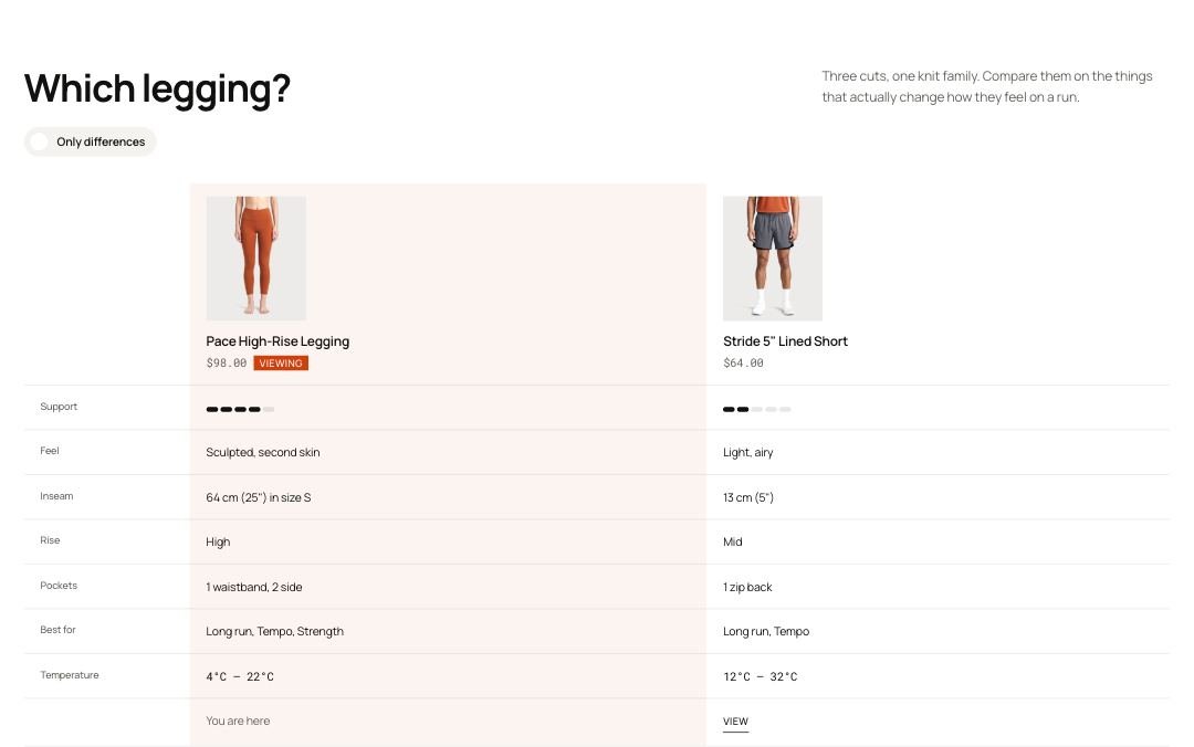 Product compareA table that compares the current product with up to three others, row by row, with an Only differences switch.
 Product detailsTwo tabs under the buy area. Designed for shows a lead sentence, up to four feature points and a photo or video. Description shows the product description and a specs list.
 Product informationThe main product area: a photo gallery with full-screen zoom in one of four layouts (two columns, one column, or a slider with thumbnails beside or below), and a buy column with title, price, options, Add to bag and many optional blocks.
Product reviewsA reviews area with a summary card showing the average rating and review count, next to the reviews from your reviews app.
Storytelling
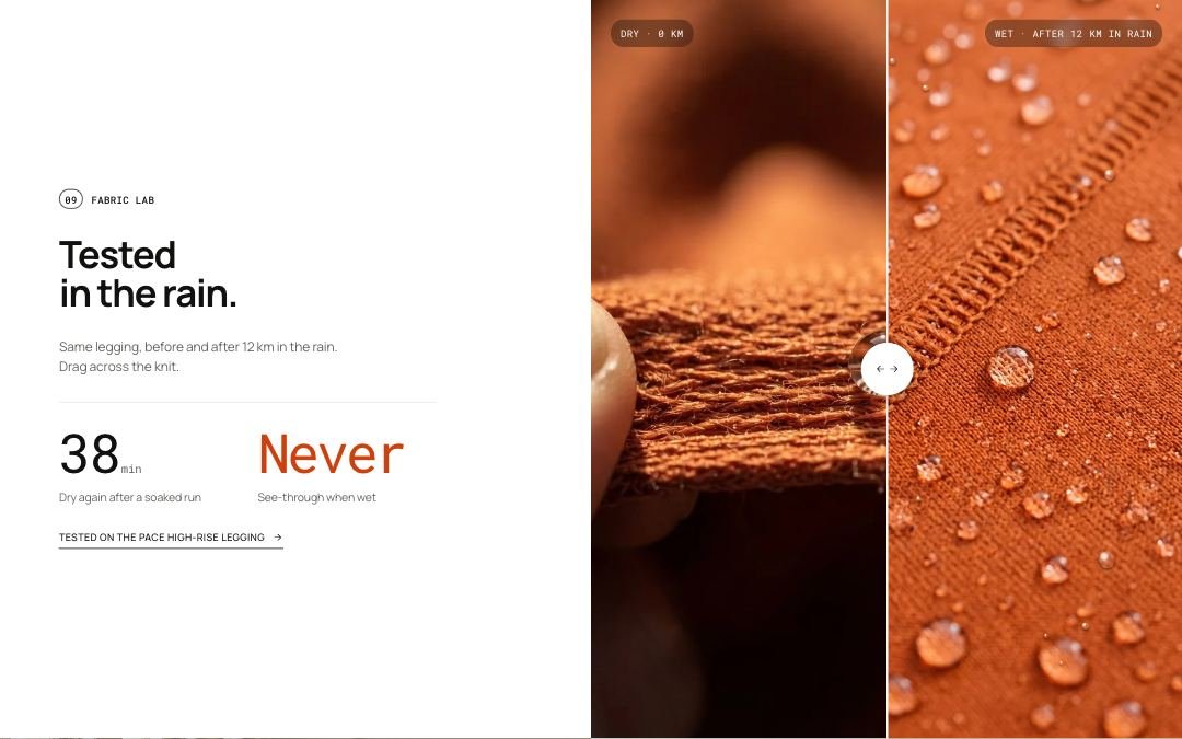 Before and afterA before and after slider next to a heading, two stats and a link to the tested product. Shoppers drag across the photo to compare the two states, such as dry and wet fabric.
 Blog postsA heading and a row of the latest posts from one blog, with a link to the full blog.
 Color storyA full-color panel for one colorway at a time. Shoppers tap a swatch and the background washes into that color, with its own name, text, photo and a link to its collection.
 Distance storyA scrolling story told along a race distance. On desktop the section stays in place while a counter runs up to the total distance and each mark takes over with its own text, product and background photo.
 Fabric libraryA grid of fabric cards. Each card shows a swatch, blend, weight, 1 to 5 scores for stretch, breathability and compression, a short feel and care note, and the products made from it.
Image with textA photo beside a column of blocks: a label, a heading, text, buttons or any other block. The photo can sit on either side at the width you choose, with an optional card on it.
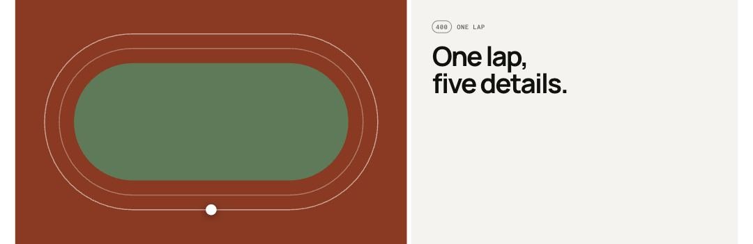 LapA running track drawing with numbered checkpoints and a dot that loops the lap. Each checkpoint stands for a product detail, and the matching item in the list lights up as the dot passes.
Layout gridA free layout of up to 12 blocks on a 12-column grid: photos, videos, text panels, products and numbers, each with its own width and height. Six ready-made layouts get you started, including Image with text.
 Made to lastA two-column block with a heading, text and link next to a photo, an optional repair ticket card over the photo, and a row of stats underneath.
 ManifestoA large statement in your own words, with an optional short timeline of moments and a signature with portrait. Words light up one by one as the shopper scrolls.
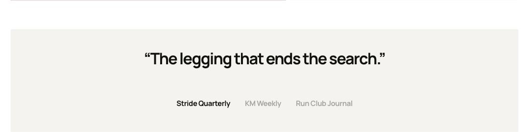 PressPublication logos or names in three layouts: one quote above the row, the quote beside a cover photo, or a logo row on its own that can scroll slowly.
 Process stepsSteps of how something is made, from first sketch to delivery, in six layouts: a sticky image beside the steps, a timeline (one side or alternating), cards, expanding photo panels or a carousel timeline with markers.
 Product rulesA framed checklist of the rules every product must pass. Each rule has a number, a big figure, a heading and text, and a tick draws in as it scrolls into view.
 Related storiesA row of other posts from the same blog, shown under a blog post to keep shoppers reading.
 Rich textA simple text block made of headings, paragraphs and buttons, in any order.
Scroll cardsA story told in cards as the page scrolls: stacking cards that pile up under the header, or full-screen story panels whose photos drift slower than the page.
 TeamA grid of team cards styled like race bibs. Each card shows a photo, bib number, name, role and two short details.
 TestimonialsA side-scrolling row of customer quotes, each with a photo, name, detail line and a link to the product they wear. An optional press row scrolls slowly underneath.
 Word definitionA dictionary-style entry for one word, with pronunciation and up to four numbered meanings. Each meaning can carry a small visual such as segments, two bars or moving dots.
Community and social
 Club feedYour weekly club sessions as a story-style phone player or as a row of video cards. Each session has a short video or photo, the products worn with a kit total and quick add, and an optional add to calendar link.
 Club runA full-width photo with a heading, text and button on one side and a weekly schedule of sessions on the other.
 Social wallPhoto, video and quote tiles that link to your social posts or profile, as a grid, a wall, a carousel or a slowly scrolling strip, with a heading and short intro.
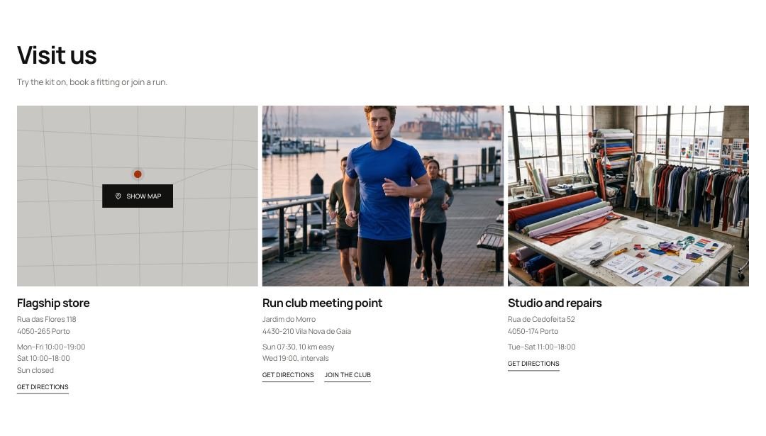 Store locationsA card for each shop, studio or meeting point: photo, address, opening hours, phone and a directions link, with an optional live map.
Interactive tools
 Conditions kitA thermometer slider and condition buttons such as rain, wind or dark that build one outfit from your slots, like Top, Bottom and Extras. Each piece says why it was picked, and shoppers can add the whole kit to the cart.
Contact formA contact form for any page, with a heading and text above or beside it. The form is built from the same field blocks as the Contact page.
 Fit finderA short quiz with one activity choice and two answer scales that shows the best matching product next to a photo for that activity. The answers are saved as the shopper's fit profile.
Product finderQuestions with answers that lead shoppers to products: a step-by-step quiz with a results grid, a row of dropdowns, or a sentence with lists in it.
Header, footer and pop-ups
Age gateA full-screen check that covers the store until the visitor confirms their age. The answer is remembered for a set number of days.
Announcement barA slim bar at the top of every page with short messages, shown one at a time or as a scrolling row, each with an optional link. A countdown message counts down to a real date.
Before you leaveA last offer for shoppers about to leave: blocks such as a heading, a discount code with Copy, a countdown and a No thanks link, beside products picked for the bag, from a collection or chosen by hand.
BreadcrumbsA slim trail from Home to the current page, for any template: products (through the collection the shopper came from), collections, blogs and posts, pages, search and the cart. Search engines get it as BreadcrumbList data.
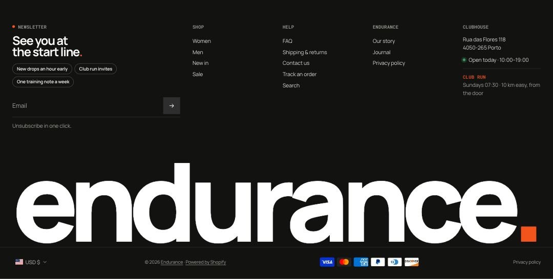 FooterThe bottom of every page, built from blocks such as a newsletter sign-up, link menus, text, contact details, brand, image and custom code, with a large wordmark and a legal row with payment icons and policies.
 HeaderThe top bar with your logo, main menu, search, account and cart. It supports six desktop layouts (one keeps the menu in a side drawer), dropdowns, up to six mega menus, extra links, buttons and text, a highlighted menu item, a separate phone menu and a search panel, opened from an icon or a search field.
Newsletter popupA newsletter sign-up as a centered window or a corner card. Its content is blocks around the email field (label, heading, text, interest chips, a note, a No thanks link) and in the thank-you step (heading, a discount code with Copy, a button).
Phone tab barA row of shortcuts fixed to the bottom of the screen on phones and tablets: Home, Shop, Search, Menu, Account, Bag and your own links. Search, Menu and Bag open the same panels as the header, and the Bag tab shows the item count.
 PromisesA row of up to four short promises, each with an icon, title, text and optional link, such as returns, shipping and repairs.
FooterThe bottom of every page, built from blocks such as a newsletter sign-up, link menus, text, contact details, brand, image and custom code, with a large wordmark and a legal row with payment icons and policies.
HeaderThe top bar with your logo, main menu, search, account and cart. It supports six desktop layouts (one keeps the menu in a side drawer), dropdowns, up to six mega menus, extra links, buttons and text, a highlighted menu item, a separate phone menu and a search panel, opened from an icon or a search field.
Newsletter popupA newsletter sign-up as a centered window or a corner card. Its content is blocks around the email field (label, heading, text, interest chips, a note, a No thanks link) and in the thank-you step (heading, a discount code with Copy, a button).
Phone tab barA row of shortcuts fixed to the bottom of the screen on phones and tablets: Home, Shop, Search, Menu, Account, Bag and your own links. Search, Menu and Bag open the same panels as the header, and the Bag tab shows the item count.
PromisesA row of up to four short promises, each with an icon, title, text and optional link, such as returns, shipping and repairs.
Page templates
 404 pageThe page shoppers see when a link is broken. A full-screen photo with a heading, a playful split time and a card with product search and quick links.
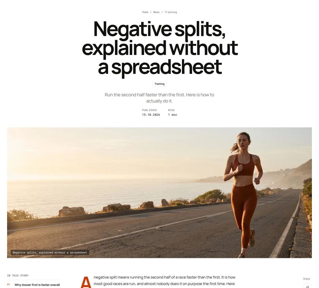 Blog postA blog post with its title, tag, author, date and reading time, a wide cover image, an "On this page" menu, share buttons, author bio and comments. A Shop this story block can show products inside the post.
 Blog postsThe blog listing page with a heading, tag filters, a large card for the newest post and a grid of the rest. You can add quote and newsletter cards inside the grid.
 CartThe full cart page: line items, totals and checkout, with cart blocks in three zones (summary, under checkout, below the cart) such as the rewards bar, gift wrap, shipping estimate, order note, discount code, terms checkbox, payment icons and recommendations. It also has an empty-cart state with quick links.
Collection descriptionA text block with the collection's description from Shopify admin, a label and a heading.
 Collections listThe page that lists all your collections. It starts with up to four large featured collection tiles, then a sorted grid of every collection with product counts.
 Compare tableA side-by-side table for up to three products picked in the compare tray. Each row shows a score, text, temperature range or price.
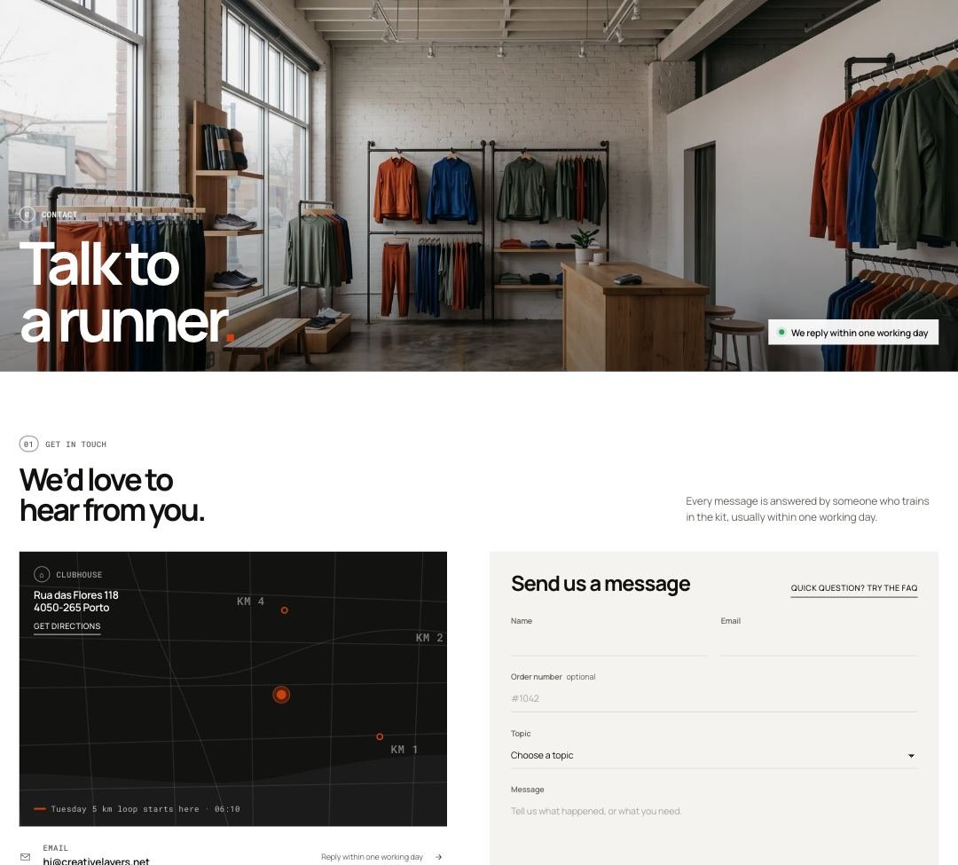 Contact pageA full contact page with an image banner, contact options, a location card with map and directions, opening hours that show open or closed today, and a contact form built from field blocks.
Custom LiquidAn empty section where you can paste code, such as an app snippet or embed, with top and bottom padding.
 FAQ pageA help center page with topics in a side menu, questions as open and close answers, a live search that highlights matches and a help card with team photos.
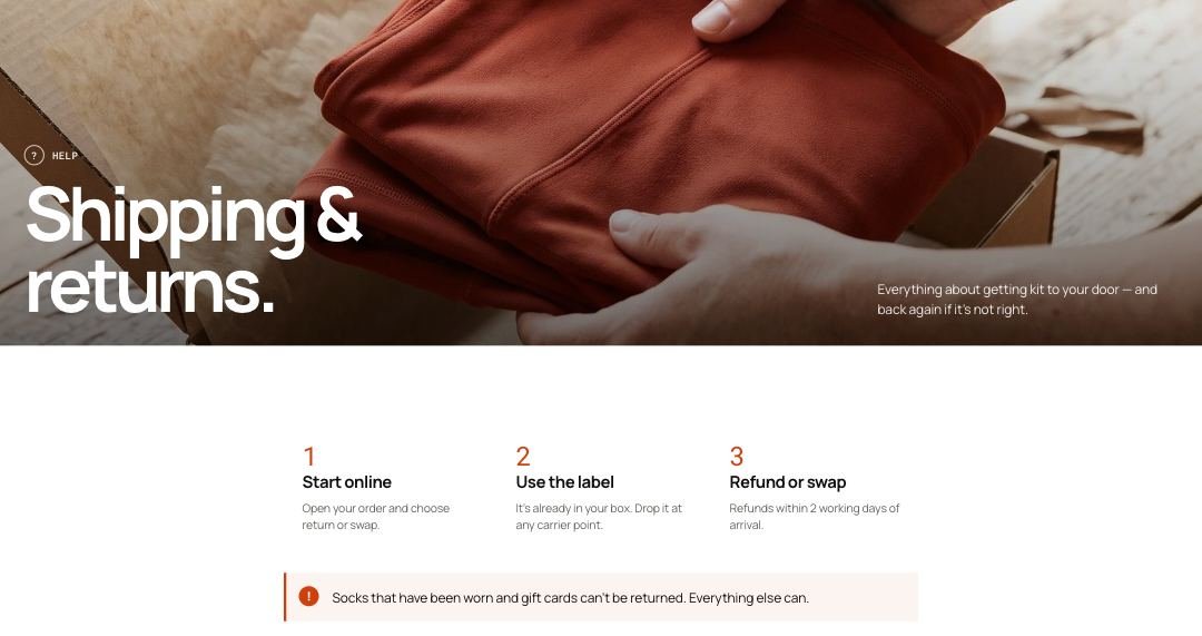 PageA standard content page with an optional image header, an "On this page" menu built from H2 headings, numbered headings and blocks for three steps or a callout inside the text.
Password pageThe page shown while your store is password protected. A full-screen photo with a heading, your password message, an optional launch countdown and a sign-up card for launch news.
 Product gridThe product grid for a collection, with filters in a drawer or sidebar, sorting, 3 or 4 columns, load more or page numbers, Shop the look tiles inside the grid and a compare tray.
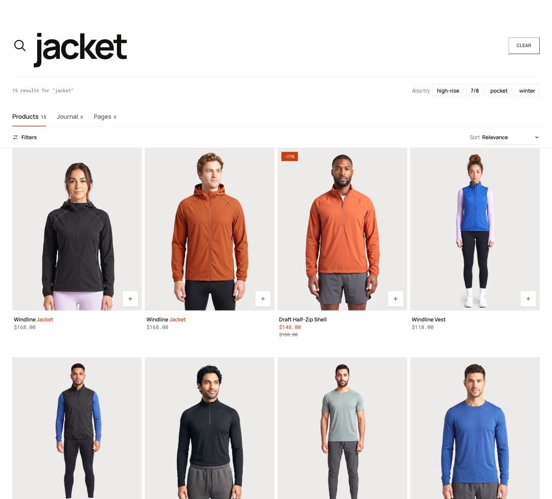 Search resultsSearch results with tabs for products, journal posts and pages, filters and sorting for products, suggested searches, a fallback product row when nothing is found and a help box.
Was this page helpful? No, ask support
Still stuck?
Contact supportSend us a screenshot and your store link. We reply within two business days.