Sections / Storytelling
Press
Publication logos or names in three layouts: one quote above the row, the quote beside a cover photo, or a logo row on its own that can scroll slowly. You have been covered by magazines or blogs and want to show what they said.
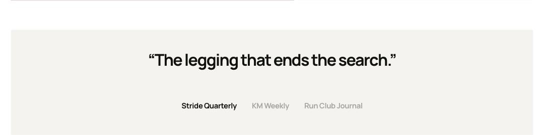 Storefront · desktop
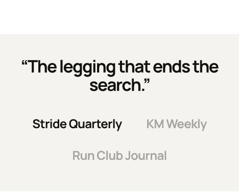 Storefront · phone
Add the section
- In the theme editor, open the page you want it on, for example Home page.
- Select Add section and choose Press.
- Select Add block to add Publication.
- Fill in the settings below, then Save.
Image sizes Desktop Logo: 320 px wide, transparent PNG or SVG. Cover Cover photo: 1400 × 1400 px, square or portrait. All image sizes

Section settings
| Setting | Type | Default | What it does |
|---|---|---|---|
| Accessible name | Text | — | Read by screen readers. |
| Layout | Choice | Quotes | Logo row shows the names or logos only, without quotes. Options: Quotes, Quote with cover, Logo row. |
| Image | Image | — | |
| Image position | Choice | Left | Options: Left, Right. |
| Autoplay | Slider 0–10s | 0s | Seconds per publication. 0 turns it off. It stops once a shopper picks one, waits while the pointer or focus is on the section, and never runs when motion is off. |
| Scroll slowly | Checkbox | Off | The row moves on its own and pauses on hover, with a pause button. It stays still when motion is off. |
| Time for one loop | Slider 10–80s | 40s | Higher is slower. |
| Heading | |||
| Heading | Text | — | Empty: no visible heading; screen readers hear the Name above. |
| Heading position | Choice | On top | Beside works on computers; phones put the heading on top. Options: On top, Beside. |
| Heading size | Choice | Default | Options: Default, Small, Medium, Large. |
| Heading tag | Choice | Auto | Changes meaning for search engines and screen readers, not the look. Auto uses H2. Choose H1 only for the main title of a page, such as a home page hero. Options: Auto, H1, H2, H3. |
| Description | Rich text | — | |
| Logos | |||
| Logo opacity | Slider 20–100% | 35% | Logos show in full on hover and when chosen. |
| Gray logos | Checkbox | On | |
| Logo size on phones | Slider 50–100% | 100% | A share of each logo's own width. |
| Layout | |||
| Space above | Choice | Default | Options: Default, None, Small, Medium, Large, Custom. |
| Space below | Choice | Default | Default follows Theme settings > Layout > Space between sections and lets edge-to-edge bands touch. Small, Medium and Large are half, equal to and one and a half times that spacing. Options: Default, None, Small, Medium, Large, Custom. |
| Space above | Slider 0–200px | 80px | |
| Space above on phones | Slider 0–200px | 56px | |
| Space below | Slider 0–200px | 80px | |
| Space below on phones | Slider 0–200px | 56px | |
| Divider above | Choice | None | Waves and curves cut into the edge of a section with its own color scheme or a background; a line works on any section. Options: None, Line, Wave, Curve out, Curve in. |
| Divider below | Choice | None | Options: None, Line, Wave, Curve out, Curve in. |
| Show on | Choice | All devices | Desktop means screens 990px and wider. A hidden section stops its timers and videos and does not load its images; in the theme editor it stays visible, faded, so you can edit it. Options: All devices, Desktop only, Mobile and tablet only. |
| Appearance | |||
| Color scheme | Color scheme | Scheme 1 | |
Blocks
Up to 8 blocks.
Publication
| Setting | Type | Default | What it does |
|---|---|---|---|
| Publication name | Text | Publication | |
| Logo | Image | — | Shown instead of the name. A transparent .png or .svg works best. |
| Logo width | Slider 60–200px | 120px | |
| Quote | Text | Add a short quote from an article or r… | |
| Article link | Link | — | Optional. Adds a link under the quote. |
| Author | Text | — | The writer's name, shown with the publication under the quote. |
| Avatar | Image | — |

Tip Use a transparent PNG or SVG logo and adjust Logo width per publication so they look the same size.
Tip Without a logo, the publication name shows as text.
Tip Layout: Quote with cover puts a photo on one side; Image position picks the side.
Tip Logo row shows the publications without quotes. Turn on Scroll slowly for a moving strip with a pause button.
Tip Heading adds a visible title. Heading position Beside puts it to the left of the publications on computers.
Tip Author (with an avatar) shows the writer and the publication under the quote.
Tip Logo opacity, Gray logos and Logo size on phones set how the logos look; they show in full on hover and when chosen.
Limitations and troubleshooting
- Up to 8 publications. Only one quote shows at a time, starting with the first.
- The quote has no visible source line unless you add an article link or an author.
- Autoplay stops once a shopper picks a publication, and never runs when motion is off; the scrolling logo row stays still then.
Related: Testimonials
Was this page helpful? No, ask support
Still stuck?
Contact supportSend us a screenshot and your store link. We reply within two business days.