Sections / Header, footer and pop-ups
Phone tab bar
A row of shortcuts fixed to the bottom of the screen on phones and tablets: Home, Shop, Search, Menu, Account, Bag and your own links. Search, Menu and Bag open the same panels as the header, and the Bag tab shows the item count. You want the main shortcuts within thumb reach for phone shoppers.
Add the section
- In the theme editor, find the Custom.overlay area of the page.
- Select Add section and choose Phone tab bar.
- Select Add block to add Home, Shop, Search, Menu.
- Fill in the settings below, then Save.
In the demo store: overlay-group.

Section settings
| Setting | Type | Default | What it does |
|---|---|---|---|
| Style | Choice | Floating dock | Dock floats above the page; the current tab shows its name. Classic runs edge to edge with every name. Options: Floating dock, Classic bar. |
| Color scheme | Color scheme | Scheme 1 | |
| Show tab names | Checkbox | On | |
| Hide while scrolling down | Checkbox | On | Comes back as soon as the shopper scrolls up. |
Note A row of shortcuts fixed to the bottom of the screen on phones and tablets. Add up to 5 tabs.
Blocks
Up to 5 blocks.
Home (up to 1)
| Setting | Type | Default | What it does |
|---|---|---|---|
| Name | Text | — | Leave blank to use the default name in the shopper's language. |

Shop (up to 1)
| Setting | Type | Default | What it does |
|---|---|---|---|
| Name | Text | — | Leave blank to use the default name in the shopper's language. |
| Collection | Collection | — | Leave blank for all products. |

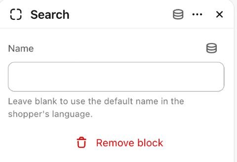
Search (up to 1)
| Setting | Type | Default | What it does |
|---|---|---|---|
| Name | Text | — | Leave blank to use the default name in the shopper's language. |
Menu (up to 1)
| Setting | Type | Default | What it does |
|---|---|---|---|
| Name | Text | — | Leave blank to use the default name in the shopper's language. |
Account (up to 1)
| Setting | Type | Default | What it does |
|---|---|---|---|
| Name | Text | — | Leave blank to use the default name in the shopper's language. |

Bag (up to 1)
| Setting | Type | Default | What it does |
|---|---|---|---|
| Name | Text | — | Leave blank to use the default name in the shopper's language. |

Link
| Setting | Type | Default | What it does |
|---|---|---|---|
| Name | Text | Stores | Needed for a link tab: a tab without a name is left out, so screen readers never meet a nameless link. |
| Link | Link | — | |
| Icon | Choice | Store | Options: Store, Location, Chat, Gift, Star, Size, Tag, Phone. |
Tip Add up to 5 tabs and drag them into order. Leave a tab's name blank to use the default name in each shopper's language.
Tip Point Shop at a collection, or leave it blank for all products. Link tabs take any address and one of eight icons.
Limitations and troubleshooting
- Only shows below 990px wide; desktop keeps the header.
- The Account tab only shows when customer accounts are turned on, and a Link tab without an address is left out.
- The product page's add-to-bag bar, the compare tray, back to top and the newsletter teaser move up so the tab bar never covers them.
Related: Header · Newsletter popup
Was this page helpful? No, ask support
Still stuck?
Contact supportSend us a screenshot and your store link. We reply within two business days.