Sections / Product page sections
Pocket map
Numbered marks on the product's front and back photos, with a list that explains each pocket, its size and what fits in it. Use it on product pages for leggings, shorts or jackets with pockets.
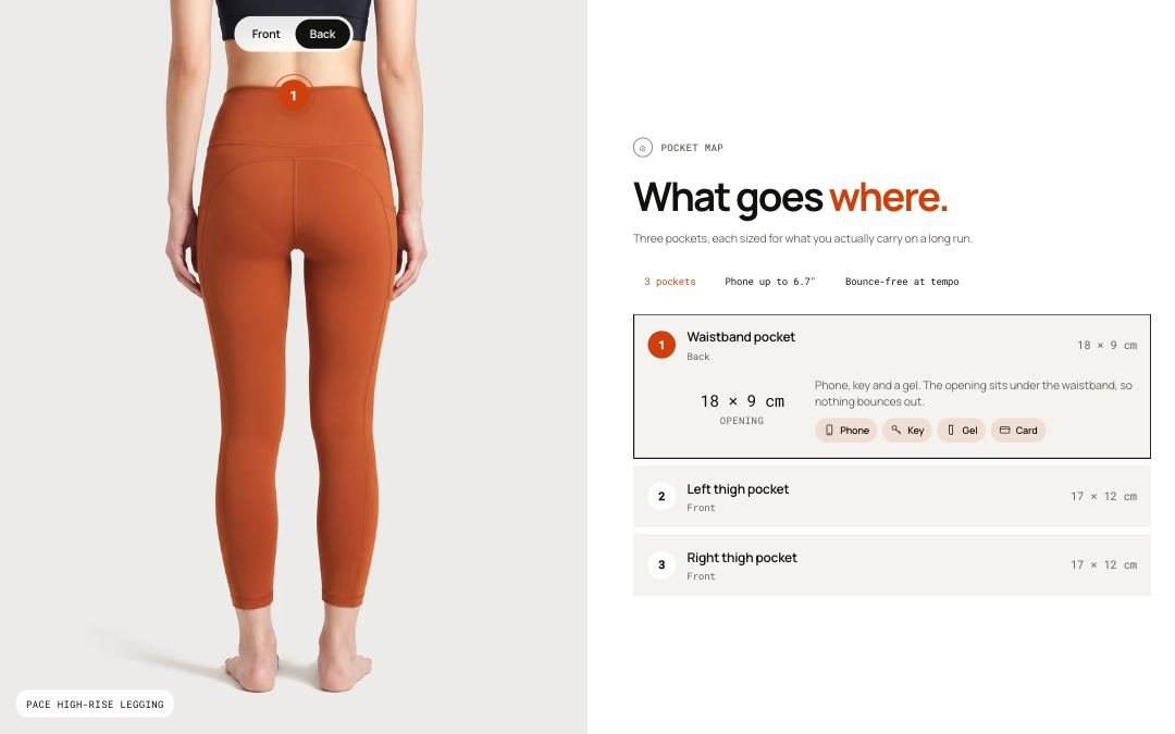 Storefront · desktop
 Storefront · phone
Add the section
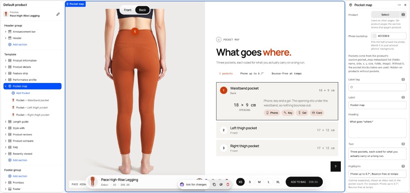
Pocket map selected in the theme editor: its blocks in the list on the left, its settings on the right.
- In the theme editor, open the page you want it on, for example Home page.
- Select Add section and choose Pocket map.
- Select Add block to add Pocket.
- Fill in the settings below, then Save.
In the demo store: page.campaign, product, product.one-column, product.thumbnails-below, product.thumbnails-beside.
Image sizes Desktop Close-up: 300 × 300 px, square. All image sizes

Section settings
| Setting | Type | Default | What it does |
|---|---|---|---|
| Product | Product | — | Used on other pages. On product pages the section shows that page’s product. |
| Photo backdrop | Color | #ECEBE9 | Fills the half around the photo. Match it to your product photos’ background. |
| Label tag | Text | ◎ | |
| Label | Text | Pocket map | |
| Heading | Text | What goes where. | |
| Text | Text | — | |
| Highlights | Text | — | Comma-separated, shown as chips next to the pocket count. For example: Phone up to 6.7", Bounce-free at tempo |
| Photos | |||
| Front photo position | Slider 0–10 | 1 | Position in the product’s media, 0 for none. The custom.pocket_front_media and custom.pocket_back_media metafields replace these per product. |
| Back photo position | Slider 0–10 | 0 | 0 hides the back view. Back pockets stay in the list but get no mark on a photo. |
| Layout | |||
| Photo below the words on phones | Checkbox | Off | Turn on when the section above ends with a photo, so two photos don’t meet. |
| Space above | Choice | Default | Options: Default, None, Small, Medium, Large, Custom. |
| Space below | Choice | Default | Default follows Theme settings > Layout > Space between sections and lets edge-to-edge bands touch. Small, Medium and Large are half, equal to and one and a half times that spacing. Options: Default, None, Small, Medium, Large, Custom. |
| Space above | Slider 0–200px | 80px | |
| Space above on phones | Slider 0–200px | 56px | |
| Space below | Slider 0–200px | 80px | |
| Space below on phones | Slider 0–200px | 56px | |
| Divider above | Choice | None | Waves and curves cut into the edge of a section with its own color scheme or a background; a line works on any section. Options: None, Line, Wave, Curve out, Curve in. |
| Divider below | Choice | None | Options: None, Line, Wave, Curve out, Curve in. |
| Show on | Choice | All devices | Desktop means screens 990px and wider. A hidden section stops its timers and videos and does not load its images; in the theme editor it stays visible, faded, so you can edit it. Options: All devices, Desktop only, Mobile and tablet only. |
| Heading | |||
| Heading size | Choice | Default | Options: Default, Small, Medium, Large, Display. |
| Heading tag | Choice | Auto | Changes meaning for search engines and screen readers, not the look. Auto uses H2. Choose H1 only for the main title of a page, such as a home page hero. Options: Auto, H1, H2, H3. |
| Appearance | |||
| Color scheme | Color scheme | Scheme 1 | |
Note Pockets come from the product’s custom.pocket_map metaobject list (fields: name, side, x, y, size, holds, image, items). Without it, the pocket blocks below are used. Hidden on products without pockets.
Blocks
Up to 8 blocks.
| Setting | Type | Default | What it does |
|---|---|---|---|
| Only on this product | Product | — | Leave empty to show the pocket on every product that uses this template. |
| Title | Text | Waistband pocket | |
| Side | Choice | Front | Options: Front, Back. |
| Horizontal position | Slider 0–100% | 50% | |
| Vertical position | Slider 0–100% | 40% | |
| Size | Text | — | |
| What fits | Text | — | |
| What fits | |||
| Phone | Checkbox | Off | |
| Key | Checkbox | Off | |
| Energy gel | Checkbox | Off | |
| Card | Checkbox | Off | |
| Close-up | Image | — | |

Tip Set pockets per product with the custom.pocket_map metaobject list (name, side, x, y, size, holds, image, items). Without it, the section's pocket blocks are used, and Only on this product limits a block to one product.
Tip Choose the front and back photos by their position in the product media, or per product with custom.pocket_front_media and custom.pocket_back_media.
Limitations and troubleshooting
- Works on any page: on product pages it shows that page's product, elsewhere the product picked in Product (hidden until one is picked).
- Hidden on products without pockets.
- The Front and Back switch only shows when there are pockets and photos for both sides.
- Up to 8 pocket blocks.
Related: Feature strip · Product details
Was this page helpful? No, ask support
Still stuck?
Contact supportSend us a screenshot and your store link. We reply within two business days.