Getting started
Settings every section shares
Space above and below, Show on, heading size and tag, and color scheme work the same way in every section.
Sections you add to a page end with the same groups of settings, in the same order: Layout, then Heading when the section has a heading of its own, then Appearance. Learn them once and they work everywhere.
- Where the heading is a block, as in Rich text, Layout grid, Slideshow and Video banner, set its size and tag on that Heading block.
- Sections built around a big word, quote or photo, such as Manifesto, Word definition and Headline with photos, keep the heading they were designed with, and sections without a heading, such as Press or Feature strip, have no Heading group.
- Pop-ups and bars that sit over the page (announcement bar, newsletter pop-up, age check, phone tab bar) have no Layout group: they don't take up room between sections.
Width
Sections that sit inside the page width, such as product rows, collection lists, rich text and the product details, have Width:
- Page width: the content stays within Theme settings → Layout → Page width.
- Full width: the content runs the full width of the screen, with the page margins kept.
- Edge to edge: on product rows, collection lists, blog posts, videos and other image sections, the content reaches the screen edges with no margins.
Sections built as full-width bands, like heroes and banners, are always edge to edge.
Space above and space below
Choose how much room a section leaves before and after itself.
- Default: follows Theme settings → Layout → Space between sections. Edge-to-edge bands, such as banners and heroes, touch each other.
- None: no space at all.
- Small, Medium and Large: half, the same as and one and a half times the section spacing. On phones they follow the phone spacing.
- Custom: your own value in pixels, with a separate value for phones, from 0 to 200.
The gap between two sections normally comes from the lower one's space above. When you set Space below on a section, that value becomes the gap under it, so None on its own brings the next section right up to it. If the next section also sets its own Space above, the two add up.

The Layout group at the bottom of every section: Space above, Space below and Show on
Dividers
Divider above and Divider below set the top and bottom edge of a section: a Line, or a Wave, Curve out or Curve in. Waves and curves show on sections that paint their own ground, a band in its own color scheme, a hero or a section with a background image, and take their own room at the edge so they never cut into text or photos. A line works on any section. Product rows, collection lists and blog posts have no dividers: they sit on the page's own ground.
Show on
Show a section everywhere, only on desktop, or only on mobile and tablet. Desktop means screens 990px and wider.
Use it for two versions of the same message: for example, a wide banner for desktop and a tall one for phones.
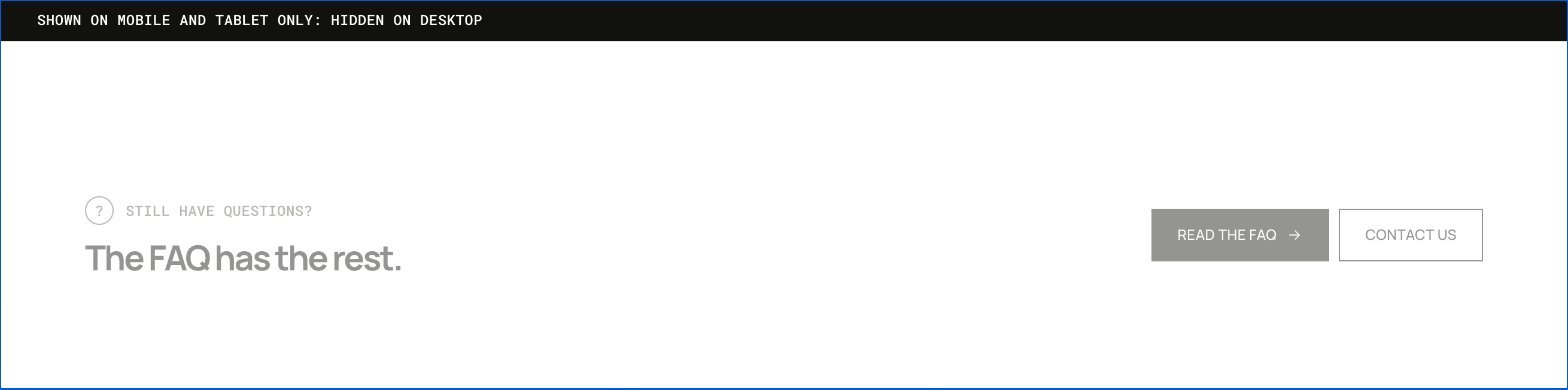
A section set to Mobile and tablet only, in the theme editor's desktop preview: faded, with a bar that says where it shows
- A hidden section does not load its images, and its timers, slideshows and videos stop while it is hidden.
- In the theme editor a hidden section stays visible, faded, with a bar that says where it shows. You can still select and edit it.
- The page code of a hidden section still loads, so keep very large videos out of sections you hide.
The collection banner has no Show on setting: it holds the page title, which must show on every device.
Heading size and heading tag
Heading size changes how big the section's heading looks:
- Default: the size the section was designed with.
- Small, Medium, Large and Display: the theme's four heading sizes. Theme settings → Typography → Headings → Size scales all of them at once.
Heading tag changes what the heading means to search engines and screen readers, not how it looks:
- Auto: H2, right for almost every section.
- H1: the main title of the page. Choose it for the first heading on your home page, such as the hero. A product, collection, blog post or page already has its own H1.
- H3: a heading that belongs under another one.

The Heading group, then Appearance with the color schemes
In a slideshow and a video banner, the heading is a block with its own Heading tag: give H1 to the first slide's heading only.
Heading options in product and content rows
Product rows, collection lists, product tabs, recommendations, recently viewed, blog posts, related stories, video and Style with add to the heading settings:
- Description: a short text under the heading, where the section has none of its own.
- Heading alignment: Theme setting follows Theme settings → Layout → Section heading alignment; Left or Center sets this section only.
- Space under the heading: the gap between the heading row and the products; 0 keeps the design.
- View all style and View all position: the link to the collection or blog as a button, a secondary button or a text link, beside the heading or centered below the products.
Product and collection rows
Featured collection, Collection list, Blog posts, Product recommendations, Product tabs and Store locations (Cards and Carousel) share these row settings:
- Columns on tablets: 2, 3 or 4 on screens from 750 to 989px; Auto follows the phone layout.
- Space between cards: 8px is the design; on phones the space is three quarters of it.
- Card width on phones: how wide each card is when the row swipes on phones; 72% shows a slice of the next card.
With Layout: Slider (Store locations: Carousel):
- Arrows: beside the heading, or on the sides of the row. (Product tabs keep theirs beside the heading.)
- Pagination: dots, a progress line or a counter under the row.
- Show part of the next card and Fade the edges: hints that the row scrolls. An edge fades only while more cards wait on that side.
- Move by itself every: the row steps on by one card every few seconds, and goes back to the start at the end; 0 keeps it still. It stops while the shopper points at the row or moves through it with the keyboard, and a pause button sits under it. It never moves when Theme settings → Motion is off or the device asks for reduced motion.
Background image or video
Rich text, product rows, collection lists, blog posts, videos, voices, Style with, the contact form, store locations and the layout grid can sit on a Background image, with its own image for phones, or a silent looping Background video (rich text, video, voices and the other content sections). Overlay lays a color or a gradient over it, and Overlay opacity sets how strong it is, so the text stays readable; pick a Color scheme whose text suits the photo. With a background the section becomes a full-width band.
Content box, content width and overlay color on heroes
Story hero, Lane hero, Media banner, Slideshow and Collection banner (with text over the photo) can put their words in a Content box, which keeps them readable on a busy photo:
- Color panel: a panel in a Color scheme of your choice, with its Panel opacity. The words and buttons take that scheme's colors.
- Frosted glass: a blurred, tinted pane (light when the words are dark).
- Outline, Corner radius and Padding for both.
Content width sets the words' largest width as a share of the section on computers and tablets; 100% keeps the section's design. Overlay color tints the shade over the photo (empty: black, or white with dark text).
Story hero, Media banner, Slideshow and Collection banner also have Height → Adapt to image, which follows the photo's own shape (the phone photo's on phones). A long heading still makes the section taller instead of being cut off.
Slideshow layouts and controls
The Slideshow has four Layouts:
- Text on the image (the default).
- Image beside the text: the photo fills one half, the words sit on the color scheme in the other (Image side left or right). On phones the text moves under the image.
- Text below the image: the photo on top, the words under it, on every screen size.
- Centered, next slides in view: the current slide in the middle with its neighbours dimmed at the sides; a click on a neighbour brings it forward.
Pagination adds a Counter (01 / 04) beside bars, dots and numbers, and Controls alignment places dots, numbers or the counter left, centered or right. Let the next section overlap moves the next section up over the bottom of the slides, for example product cards over the photo; set that section's space above to 0 for the most overlap.
Video descriptions
The background videos of Media banner and of each Slideshow slide have a Description. Filled, screen readers read it as the video's name; empty, the video counts as decoration and they skip it.
Promo panel beside products
Featured collection and Product tabs take a Promo panel block: a photo or video (or a color panel) with a label, heading, text and a button, beside the products.
- Panel side left or right, and its Width (20–50%).
- Stay in view while scrolling keeps it on screen on computers while a long product row scrolls past.
- On phones: above the products, below them, or hidden.
- Overlay opacity and Dark text on the image keep the words readable; with no button label, the whole panel links to the Link.
Product tabs options
Product tabs can show its tabs as Pills (the default), Underline or Text (Tab style), and put them Beside the heading, Under the heading or In a column beside the products (Tab position; on phones the column becomes a row above the products). Each tab can have a short Description shown above its products.
Colour scheme
Pick one of the color schemes from Theme settings → Colors. Text, links, buttons, fields and borders inside the section follow it.
- On your first scheme (the page's own colors) nothing changes around the section.
- On another scheme a full-width section becomes a colored band, and a section inside the page margins becomes a rounded panel.
- Sections built on photos, such as Color story or Shop the look, only change their colors.
Color scheme area and border
On rich text, the contact form, the layout grid, product tabs, recommendations, recently viewed, related stories, Style with, compare, store locations, video, voices and the social wall, Color scheme area decides where a scheme other than the page's shows: a Full-width band across the screen, or a Box, a panel within the page width that follows the corner style. Border draws a thin line round the section, with room inside it.
Blocks in Rich text
Rich text is built from shared blocks: Heading, Text, Button, Image, Email signup, Group, Collapsible row, Icon, Video, Spacer, Divider, Counter, Countdown and Before and after. See Shared blocks. Add them in any order. The Newsletter preset (Add section → Rich text: Newsletter) is a heading, a line of text and an email signup, ready to edit.
- A Group holds other blocks in a column or a row. Use the Button row preset for two buttons side by side; on phones a row stacks into a column unless you turn that off.
- Spacing between blocks is set on the group, so every block in it lines up.
- A Group can also take Padding, a border and its own color scheme, which turns it into a card. Space between spreads a row across the width.
- Heading and Text have their own Alignment; Follow section keeps the section's. Text can be Soft or Strong and Narrow (easy line length) or Full width.
- Button can hide its arrow and run the full width. Image takes a separate photo for phones.
- Collapsible row is a heading that opens to text; several in a row make a short FAQ. Icon shows a line icon with a short text. Video plays a video uploaded to Shopify or a YouTube or Vimeo link, with its controls. Spacer adds empty space, with its own height on phones.
- In Heading, select words and make them italic to color them with the accent color.
- Email signup adds the visitor to your customer list with the newsletter tag, like the footer form. Put it in a Group to sit beside a button, or in a Layout grid text cell beside a photo: the Layout grid: photo and newsletter preset is set up that way.
Rich text also works as a flexible section: Alignment left, center or right; Direction → Horizontal puts the blocks side by side with a Spread (start, center, end or space between) and Swipe on phones; Space between blocks in pixels; Content width narrow, default, wide or full; and a Height (small to full screen) with the content at the top, middle or bottom. App blocks can go in it too.
Empty content
The theme editor shows everything you've added, so you can see what is left to fill in. Visitors only see what is complete:
- A button or link with a label but no link stays in the editor only. It never sends visitors to the home page by mistake.
- A block without its name, such as a color, a door, a press outlet or a lap checkpoint with an empty title, stays in the editor only. The blocks around it close up and keep working.
- A block with nothing to show yet, such as a collapsible row without text, a mega menu column without collections or a Size and fit block on a product without fit details, shows a short note in the editor that says what it needs. Visitors don't see it.
- A heading you leave empty isn't output at all.
- A Featured collection whose collection has no products is hidden from visitors. With no collection chosen yet, it shows example cards.
- Sections that need something picked first, such as Video, Collection list and Pairs well with, are hidden from visitors until it is. The editor shows a placeholder with a note.
Finding blocks in the editor list
Blocks with a title show it next to their type in the editor's list, for example Question - How do I track my order?, Row - Support or Contact option - Email. Long lists such as FAQ questions, compare rows, menu links and form fields stay easy to find.
Send us a screenshot and your store link. We reply within two business days.