Header, footer and pop-ups
Menus and mega menu
Build the main menu, turn a top-level link into a mega menu, add links and buttons to the header and give phones a shorter menu.
Header layout, sticky behaviour, the transparent header and the announcement bar are on the Header and announcement bar page.
The main menu
Menus are made in Shopify admin, not in the theme: Content → Menus. Open Main menu and add links. Drag a link under another one to make a dropdown; Endurance shows up to three levels.
In the theme editor, select Header to choose which menu it uses.
What's in the header
In the theme editor, open Header. Its tree shows:
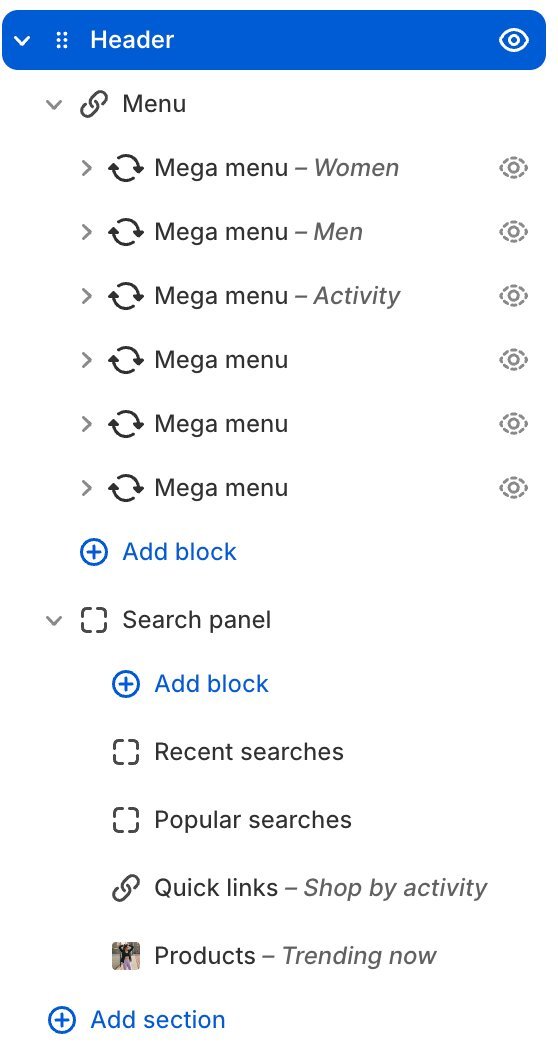
The Header tree: Menu with six Mega menu slots, each named after its Menu item title, then the Search panel and its blocks
- Menu: the main navigation and the phone drawer. Inside it are six Mega menu slots.
- Any Link, Button or Text you add with Add block (up to six). They sit next to the search, account and cart icons. Each one has a Show on setting for desktop, phones or both.
Search and the cart are always in the header. The account icon shows whenever customer accounts are turned on in Settings → Customer accounts, as the Theme Store requires.
Turn a link into a mega menu
A mega menu is a full-width panel under a top-level link.
- In the theme editor, open Header → Menu and select an empty Mega menu slot.
- Under Menu item, pick the Collection the menu item links to, for example Women. The mega menu opens under that item in every language. For a menu item that doesn't link to a collection, paste its exact address in Link instead.
- Choose a Layout:
- Columns: the item's dropdown links as columns, plus product picks and a promo photo.
- Collection banners: up to four tall photos, each linking to a collection.
- Category index: a list of collections with small photos, then your picked products, or the promo photo when no products are picked.
- Columns from blocks: build the panel yourself from column blocks (below).
- Type the item's name in Menu item title, for example Women. The slot then shows as Mega menu - Women in the editor list, so you can tell the six slots apart.
- Fill in the photos and links for that layout, then Save. The panel only shows the settings the chosen layout uses: Banner image 1–4 appear with Collection banners, the feature photo with Columns, the promo with Columns and Category index. Activity collections and Products always show because Shopify can't hide list pickers; layouts that don't use them ignore them (Products work in Columns and Category index).
Two settings shape the panel:
- Link columns (1–4): how many columns the item's dropdown links fill. Category index uses it for its list of collections. Collection banners ignores it.
- Picture column width: how wide each column of photos or products is, next to the links column. At 100% they share the width equally; at 150% each photo column is half as wide again as the links column. Used by Columns and Columns from blocks.
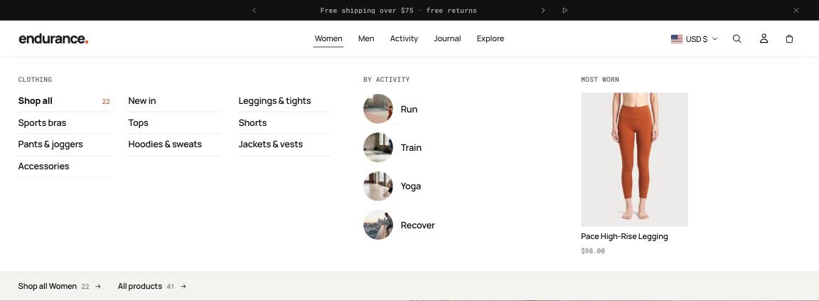
Category index with Link columns set to 3: the Women collections fill three columns before the activities and the promo photo
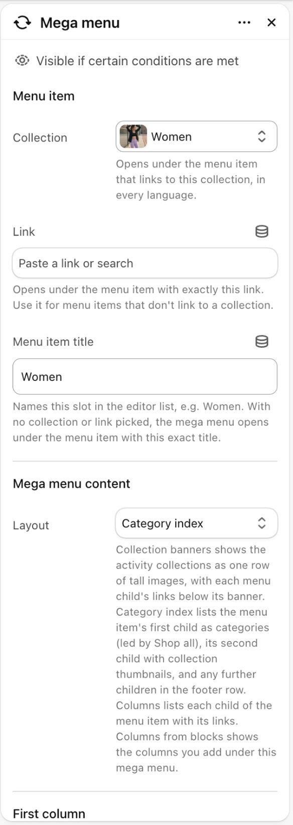
A Mega menu slot: Menu item picked by collection, the Link for other items, the Menu item title that names the slot, and the Layout
Selecting a mega menu or one of its columns in the editor opens its panel in the preview. The editor also says when something is missing; shoppers never see these notes:
- A slot with nothing to show yet (no collections, photos or products picked, and no dropdown links on the menu item) shows a note in its panel. Shoppers see the menu item as a plain link until you add content.
- A slot that no menu item opens (nothing picked, a collection or link that isn't a top-level item of the header's menu, or an item an earlier slot already uses) shows a note under the header explaining how to attach it.
- Collection banners with no collections picked shows the menu item's links, with a note pointing to First column → Activity collections.
The three ready-made layouts on the demo, from the top: Category index, Collection banners and Columns.

Category index (Women): collection links with counts, activities with small photos, and a feature photo

Collection banners (Activity): four tall photos, each with its collection and product count
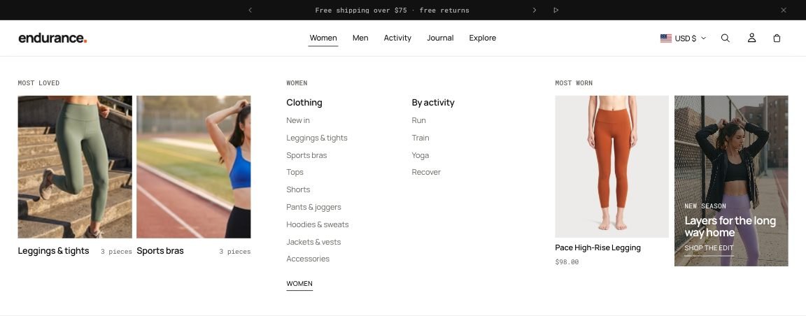
Columns: product picks, the item's dropdown links as columns, a product and a promo photo
Columns from blocks
With the Columns from blocks layout, select the mega menu and use Add block to add columns. Drag them to change their order.
| Column | What it shows |
|---|---|
| Collections | Up to 4 collections, as photo tiles or round thumbnails, with their product count |
| Feature image | One photo with a label, heading and link. Hidden from shoppers until you pick a photo |
| Products | Up to 4 products with photo and price |
| Promo | A colored card for a drop or campaign |
A column whose link is empty links to the mega menu's collection.
Menu item links adds the item's own links from your Shopify menu as one more column: first, last or not at all.
Search panel
Selecting the search icon opens a panel. Before the shopper types, it shows the blocks under Header → Search panel: Recent searches (the shopper's last five searches on this device, with Clear; hidden until they have searched), Popular searches (searches separated by commas), Quick links (collections with their product count, or a menu) and Products you pick one by one or from a collection. Reorder or remove them; Products always takes the wide column. While the shopper types, live results replace the panel.
Selecting one of these blocks in the theme editor opens the panel, and it stays open while you edit. A Quick links block with no collections or menu, or a Products block with no products or collection, shows nothing to shoppers; in the editor it says what to pick.
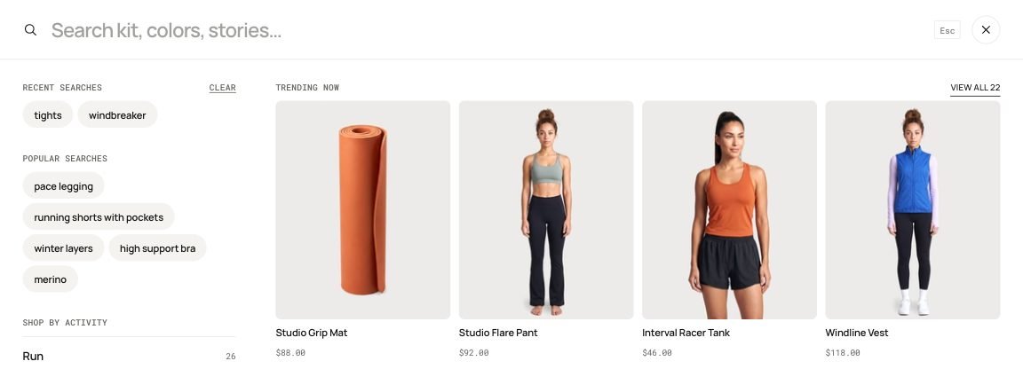
The search panel before typing: Recent searches with Clear, Popular searches, Shop by activity and Trending now
With Header → Search on desktop set to Search field, the bar shows a field instead of the icon. Typing in it or clicking it opens the same panel with the words carried over; moving through the header with the Tab key doesn't open it. The field shows on screens 1280px and wider; smaller screens and phones keep the icon.


Left: Search on desktop in the Header panel. Right: set to Search field, the field sits beside the account and bag icons
Phones
On phones the menu opens as a drawer. Links with a mega menu become tabs at the top of the drawer, with the mega menu's Promo image as a card. To show a shorter menu on phones, create a second menu in Content → Menus and pick it in Header → Menu on phones.
Header → Phone menu style sets how each tab is laid out:
- Compact (the default): the tabs sit in a switch, the first links show as photo tiles, the other links sit in two columns and the activity links become small chips with a photo. Photo tiles sets how many links show as photos: 0, 2 or 4. A link to a collection uses the collection's image; a link to a tag of the tab's own collection, such as Women › New in, uses the first tagged product's photo so the tab's photo doesn't repeat. A tab whose links have no links under them, such as Activity › Run, Train, Yoga, Recover, shows them all as tiles when there are four or fewer.
- Large list: one link per row in big type, the activity links as round photos.

The Women tab of the compact phone menu: photo tiles, two columns of links, activity chips and the promo card
Highlight a link
Type a link's title in Header → Highlight a menu item, for example Sale, to show it in the accent color, or pick your own in Highlight color. The color shows in the header and in the phone menu; on a photo tile it shows as a dot before the name. While the header lies over a photo, the highlighted link keeps the header's light text and gets a line under it instead, so a dark color never disappears into the photo.
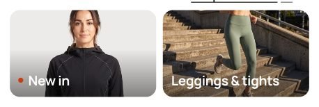
The demo highlights New in: on its photo tile in the phone menu it gets an accent dot
See all header settings on the Header page.
Send us a screenshot and your store link. We reply within two business days.