Sections / Storytelling
Lap
A running track drawing with numbered checkpoints and a dot that loops the lap. Each checkpoint stands for a product detail, and the matching item in the list lights up as the dot passes. You want to show five or so product details in a playful way on a product or story page.
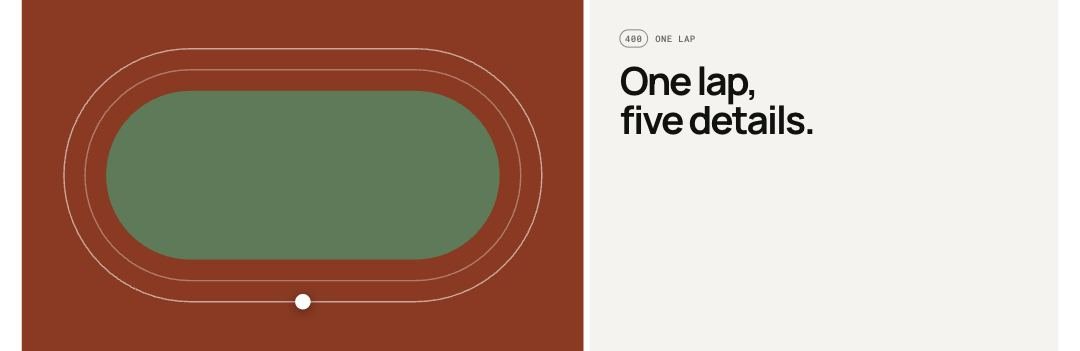 Storefront · desktop
 Storefront · phone
Add the section
- In the theme editor, open the page you want it on, for example Home page.
- Select Add section and choose Lap.
- Select Add block to add Checkpoint.
- Fill in the settings below, then Save.
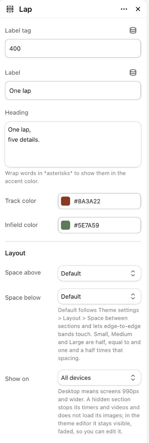
Section settings
| Setting | Type | Default | What it does |
|---|---|---|---|
| Label tag | Text | 400 | |
| Label | Text | One lap | |
| Heading | Text | One lap, five details. | Wrap words in asterisks to highlight them. Their look comes from Theme settings → Text styles → Highlighted words. |
| Track color | Color | #8a3a22 | |
| Infield color | Color | #5e7a59 | |
| Layout | |||
| Space above | Choice | Default | Options: Default, None, Small, Medium, Large, Custom. |
| Space below | Choice | Default | Default follows Theme settings > Layout > Space between sections and lets edge-to-edge bands touch. Small, Medium and Large are half, equal to and one and a half times that spacing. Options: Default, None, Small, Medium, Large, Custom. |
| Space above | Slider 0–200px | 80px | |
| Space above on phones | Slider 0–200px | 56px | |
| Space below | Slider 0–200px | 80px | |
| Space below on phones | Slider 0–200px | 56px | |
| Divider above | Choice | None | Waves and curves cut into the edge of a section with its own color scheme or a background; a line works on any section. Options: None, Line, Wave, Curve out, Curve in. |
| Divider below | Choice | None | Options: None, Line, Wave, Curve out, Curve in. |
| Show on | Choice | All devices | Desktop means screens 990px and wider. A hidden section stops its timers and videos and does not load its images; in the theme editor it stays visible, faded, so you can edit it. Options: All devices, Desktop only, Mobile and tablet only. |
| Heading | |||
| Heading size | Choice | Default | Options: Default, Small, Medium, Large, Display. |
| Heading tag | Choice | Auto | Changes meaning for search engines and screen readers, not the look. Auto uses H2. Choose H1 only for the main title of a page, such as a home page hero. Options: Auto, H1, H2, H3. |
| Appearance | |||
| Color scheme | Color scheme | Scheme 1 | |
Blocks
Up to 6 blocks.
Checkpoint
| Setting | Type | Default | What it does |
|---|---|---|---|
| Distance | Text | 100 m | |
| Title | Text | Product detail | |
| Text | Text | Say what this detail does on the run. |

Tip Shoppers can click a checkpoint in the list to move the dot there and hold it.
Tip Change Track color and Infield color to match your brand instead of the default red track.
Limitations and troubleshooting
- Up to 6 checkpoints. They are spread evenly around the lap, whatever distance text you enter.
- The dot only moves while the section is on screen, pauses on hover and has a pause button. With reduced motion on it stays still.
- On phones the track and the list stack in one column.
Related: Distance story · Process steps · Product rules
Was this page helpful? No, ask support
Still stuck?
Contact supportSend us a screenshot and your store link. We reply within two business days.